MLB Mascots as the Orioles Logo
August 18, 2024
August 18, 2024
The Baltimore Orioles, one of Major League Baseball's most storied franchises, trace their roots back to 1901 when they were originally established as the Milwaukee Brewers. After a brief stint in Milwaukee and later as the St. Louis Browns, the team moved to Baltimore in 1954, adopting the Orioles name in honor of Maryland's state bird. The Orioles quickly became known for their strong farm system, which produced a wealth of homegrown talent that would lead the team to success in the 1960s and 1970s. Under the leadership of legendary Hall of Fame figures like Brooks Robinson, Frank Robinson, Cal Ripkin Jr, and manager Earl Weaver, the Orioles won three World Series titles in 1966, 1970, and 1983, establishing themselves as a powerhouse in baseball.
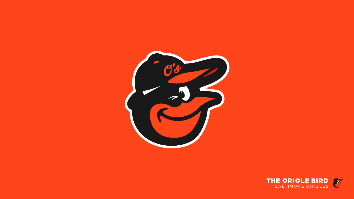
The cartoon Oriole Bird logo, first introduced in 1966, has become synonymous with the team's identity and success. Designed as a cheerful and approachable mascot, the bird reflected the team's vibrant and spirited nature during a period of great triumphs. The logo featured a black-and-orange bird, drawn with a playful expression, donning a baseball cap with the Orioles' "O" insignia. Over the years, the cartoon bird underwent several stylistic changes, but its essence remained a symbol of the team's connection to its fans and the city of Baltimore. The bird was particularly beloved by fans during the team's golden era, and its reintroduction in 2012 after a brief hiatus was met with widespread acclaim.
The Orioles' history and the cartoon bird logo are intertwined with the identity of Baltimore itself. The team's success, particularly in the 1960s and 1970s, brought a sense of pride and unity to the city, with the Oriole Bird becoming an emblem of that communal spirit. The return of the cartoon bird logo in 2012 marked a resurgence for the franchise, as it coincided with the team's return to postseason contention after years of struggles. Today, the cartoon Oriole Bird is not just a logo but a beloved symbol of tradition, resilience, and the enduring bond between the team and its fans. The legacy of the Orioles and their mascot continues to resonate with generations of baseball enthusiasts in Baltimore and beyond.
The History
In 1966, a significant shift occurred with the introduction of the cartoon Oriole Bird logo, coinciding with the Orioles' first World Series championship. This new design featured a cheerful, animated bird with a baseball cap, reflecting a more playful and approachable team identity. The cartoon bird quickly became beloved by fans, embodying the spirit of a team on the rise. This logo was used during the Orioles' most successful period, which included three World Series titles in 1966, 1970, and 1983. The bird's cheerful demeanor and association with these victories made it a lasting icon in the hearts of Orioles fans.
As the team moved into the late 1980s, the Orioles decided to shift their branding once again, introducing a more realistic bird logo in 1989. This new design was sleeker and more sophisticated, aiming to present a modernized image for the team. However, the realistic bird logo didn’t resonate as strongly with fans as the cartoon version had. Despite this change, the team struggled on the field, and the lack of success during this period contributed to a less enthusiastic reception of the new logo. The realistic bird logo became associated with a challenging era for the franchise, marked by a decline in performance and fan engagement.
In response to fan nostalgia and the desire to reconnect with their roots, the Orioles reintroduced the beloved cartoon bird logo in 2012. This reintroduction was met with widespread acclaim, as it harkened back to the team’s golden years and revitalized the connection between the team and its fan base. The return of the cartoon bird also coincided with a resurgence in the team’s fortunes, as the Orioles returned to postseason contention after a long drought. This return was seen as a symbolic return to the Orioles’ proud history and a renewed hope for the future. The cartoon bird once again became a symbol of the Orioles' spirit, linking past glories with present aspirations.
Today, the Orioles' bird logos tell a story of evolution, from the traditional, realistic depictions to the iconic cartoon bird that has come to symbolize the team's enduring legacy. Each logo iteration reflects different eras in the team's history, with the cartoon bird standing out as a particularly cherished emblem. The logo’s reappearance in 2012 reinforced its status as a timeless symbol of the Orioles' identity, representing both the team’s storied past and its ongoing journey. The evolution of the bird logos mirrors the Orioles’ own history—marked by moments of triumph, periods of struggle, and a deep connection to the city of Baltimore. The logos, especially the cartoon bird, remain a reminder of the team’s heritage and its bond with generations of fans.
1966: Possible prototype logo or temporary logo, issued to players during Spring Training 1966 and worn sporadically throughout the season. (Ref: SportsLogos.net)
1967-1974: Cartoon Oriole Bird with his eyes looking down to the lower left. Worn on Baltimore Orioles home and road caps. (Ref: SportsLogos.net)
1975-1977: This cartoon Oriole Bird has much larger pupils than the one worn from '66-'74. This logo was on the front of their home & road caps. (Ref: SportsLogos.net)
1975-1976: This cartoon Oriole Bird logo was worn on the Baltimore Orioles orange alternate caps for the '75-'76 season. (Ref: SportsLogos.net)
1978: This cartoon Oriole Bird logo with eyes looking to the lower left with black outline. Worn on front of Baltimore Orioles black and white caps. (Ref: SportsLogos.net)
1979-1988: Thinner cartoon Oriole Bird logo with eyes looking to the lower left worn on front of Baltimore Orioles black and white caps throughout the 1988 season. (Ref: SportsLogos.net)
1989-1997: An ornithologically correct black and orange oriole on black, marks the first time the signature cartoon Oriole Bird logo was not use. (Ref: SportsLogos.net)
1998-2011: A more lifelike black and orange oriole bird facing the left. Slightly updated in 2009, making bird more vertical with smaller tail feathers & replacing the yellow accent for silver. (Ref: SportsLogos.net)
2012: To celebrate the 20th Anniversary of Oriole Park at Camden Yards, the team introduced a slightly
modernized cartoon Oriole Bird logo, with the Orioles alternate "O's" insignia hat. (Ref: SportsLogos.net)
modernized cartoon Oriole Bird logo, with the Orioles alternate "O's" insignia hat. (Ref: SportsLogos.net)
The Honorable Mentions
Along with the historically documented Baltimore Orioles logos listed above, the team have some briefly or entirely unused Oriole bird logos.
1. The Warm-Up Bird (1954) The bird is born. The Orioles' original mascot as he appeared in a rough sketch by his creator, the Sun's Jim Hartzell.
2. The Warm-Up Bird (1966) Right after designer Stan Walsh - creator of such unforgettable icons as the Hamm's Bear and Snap, Crackle and Pop - got the bird all dressed up, the Orioles gave him someplace to go. The 1966 World Series.
3. The Psycho Bird (1968) After a disappointing 1967 season, this character, also known as the Psycho Bird, told us to "Wait Til This Year." As it turned out, he and the Orioles had to wait until the next year to face the Miracle Mets in the '69 World Series.
4. The Baby Bird (1997) In 1997, the Orioles created a new "fun bird" which has played a variety of roles in the Orioles organization. The Baby Bird now is used exclusively with youth-oriented programs.
The Concept
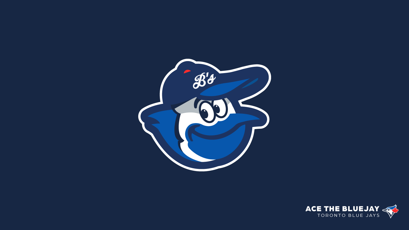
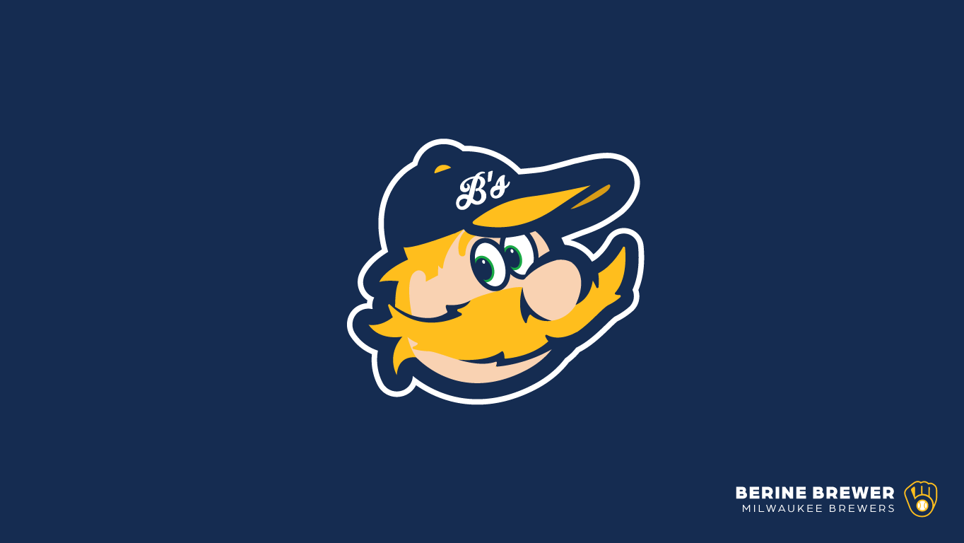
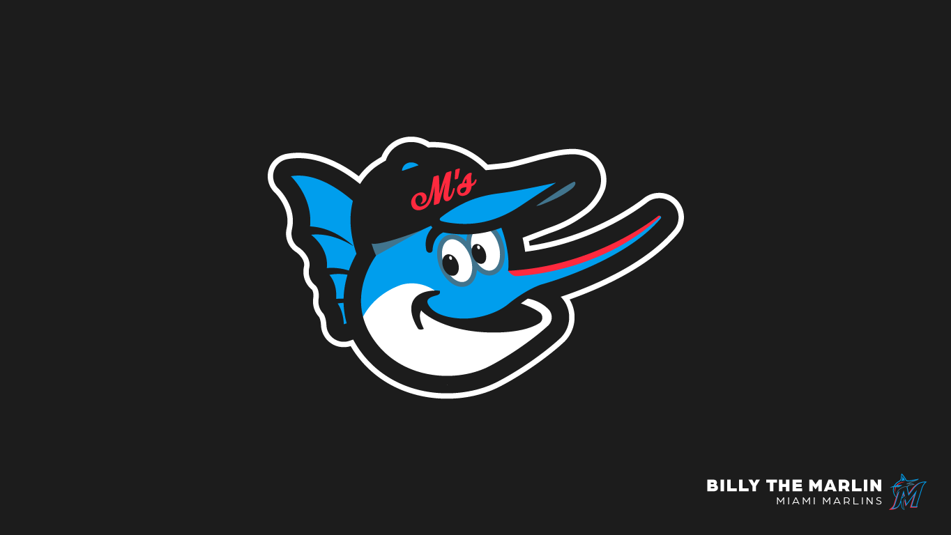
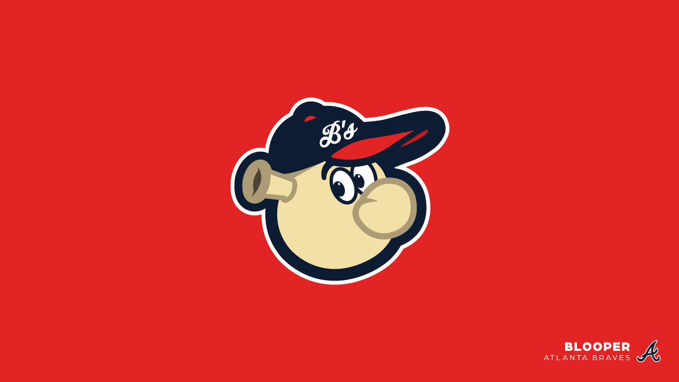
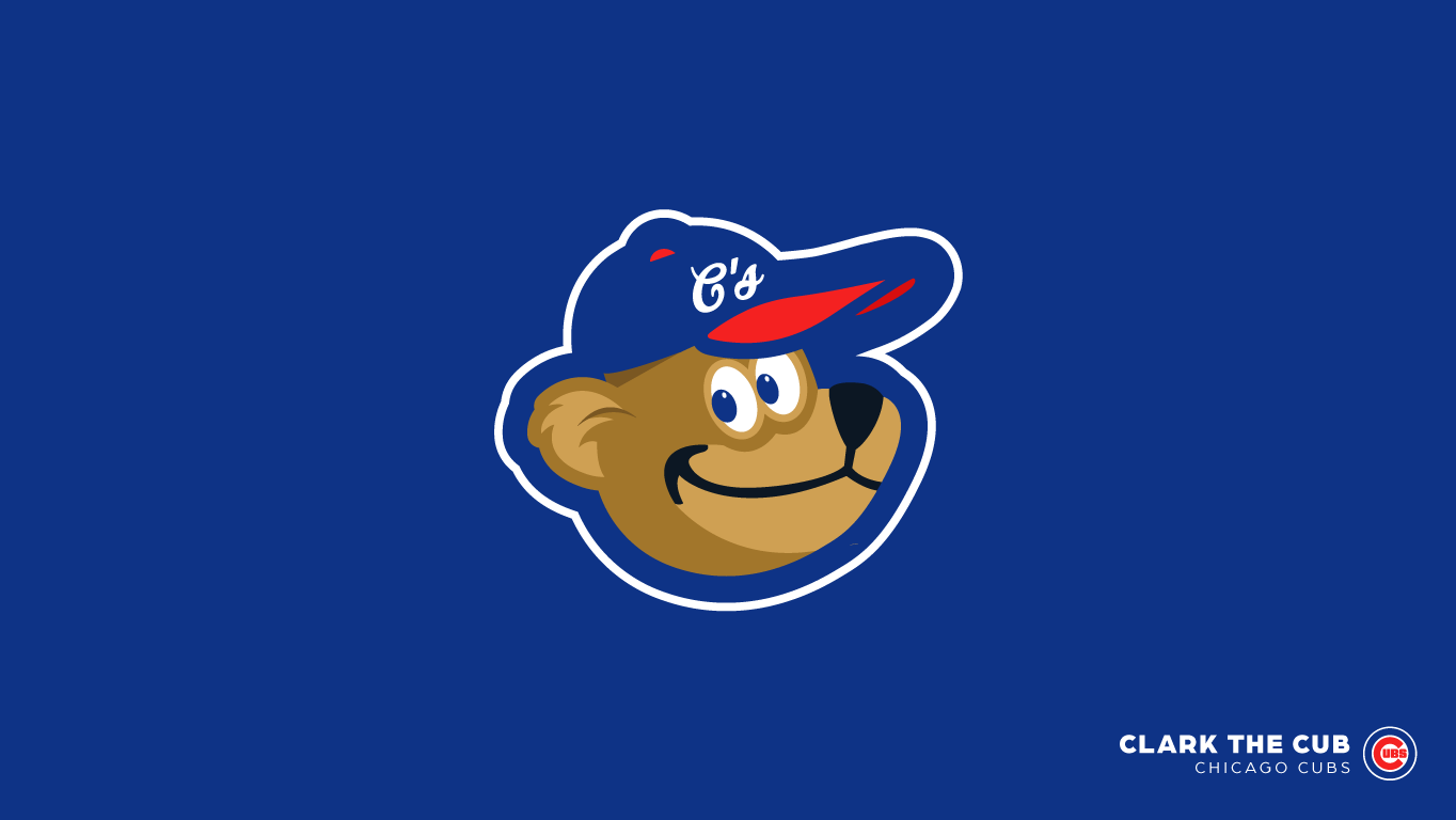
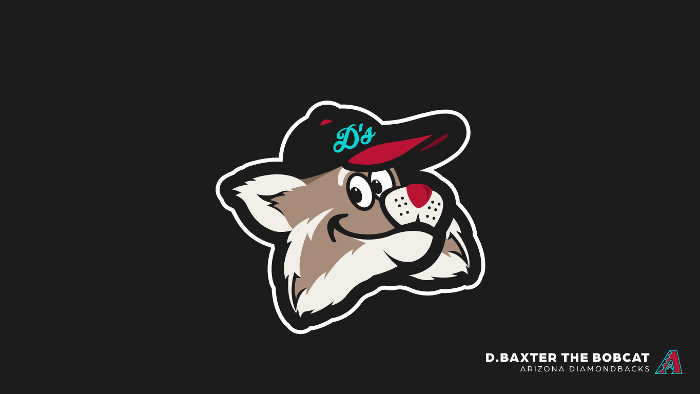
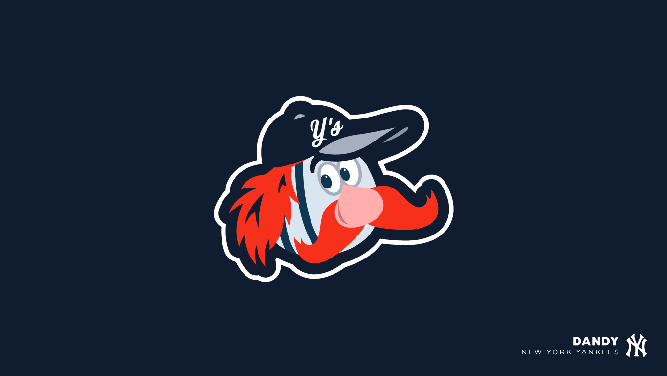
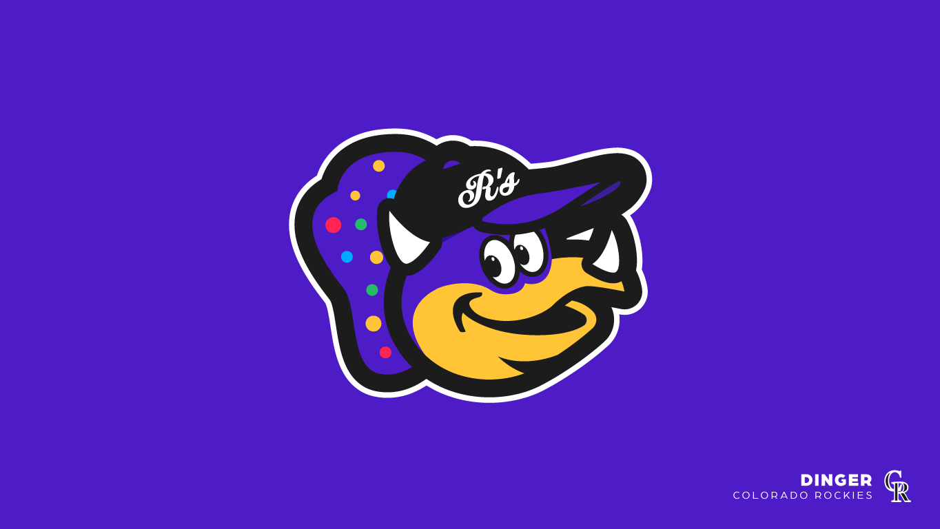
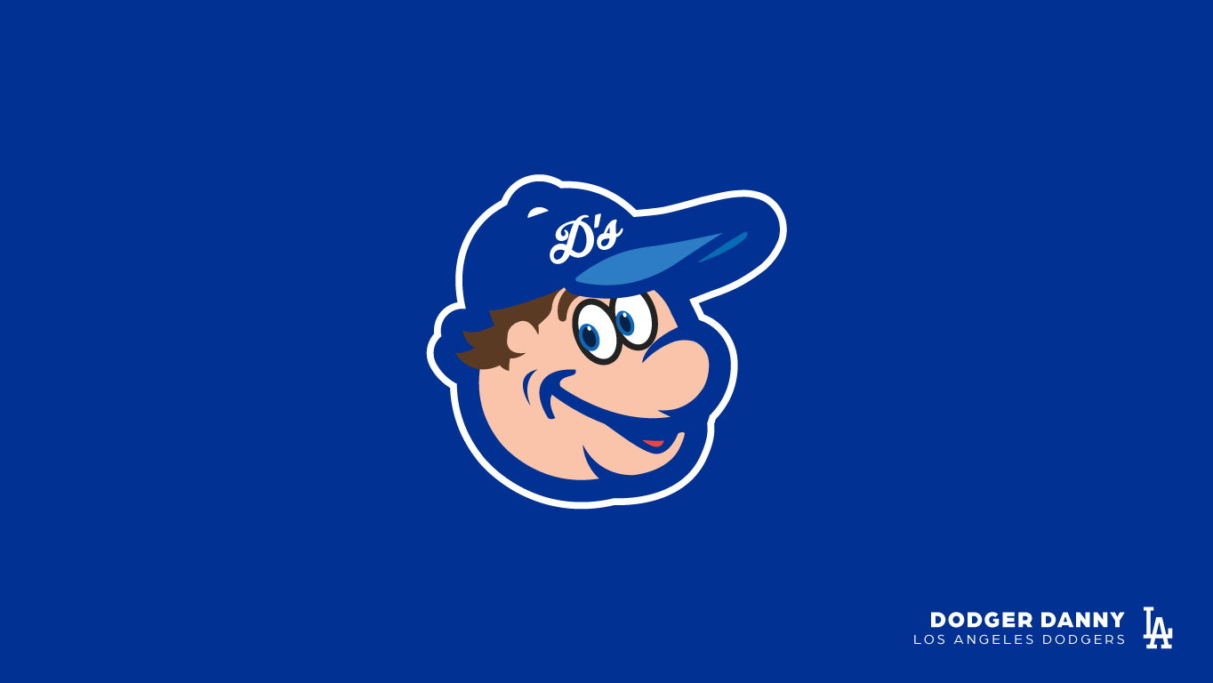
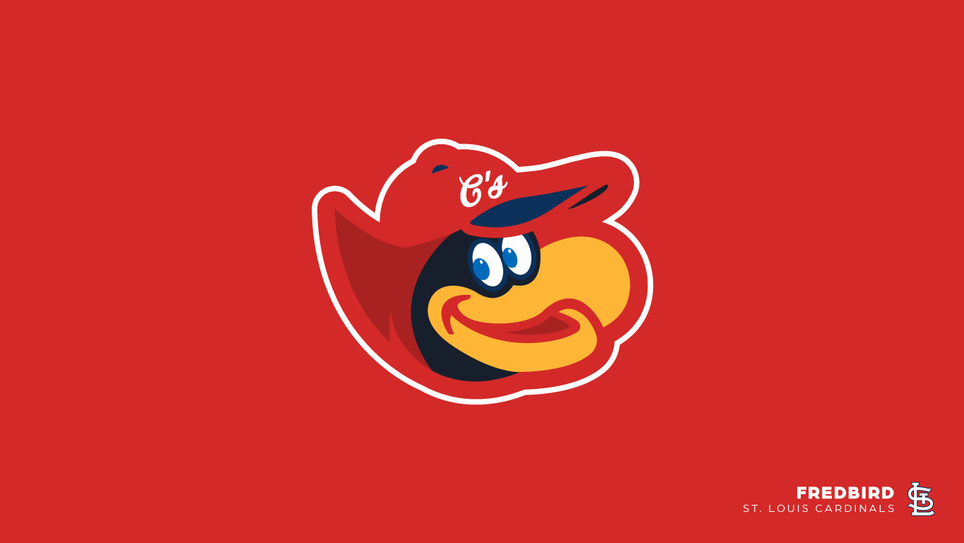
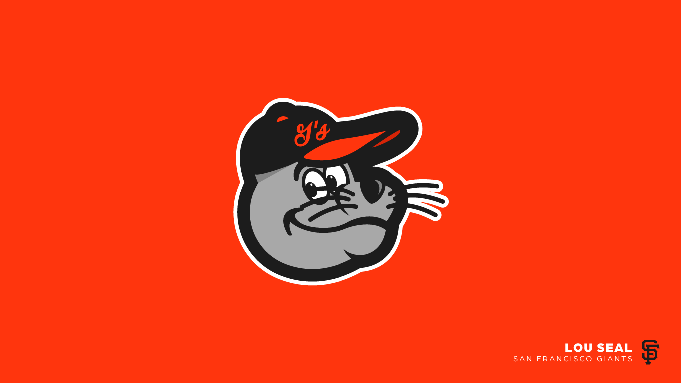
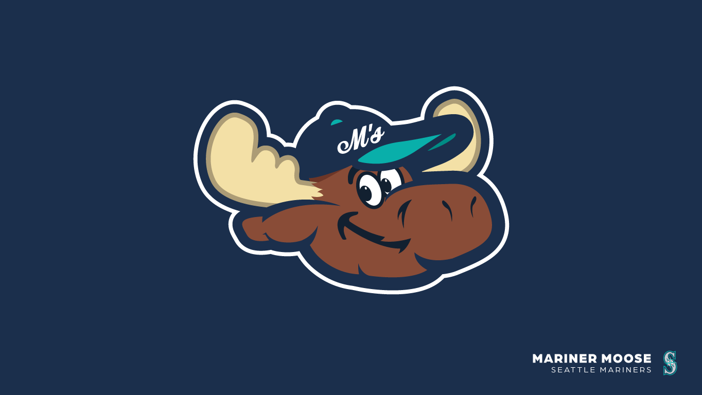
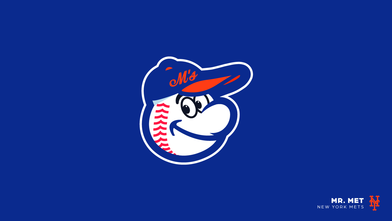
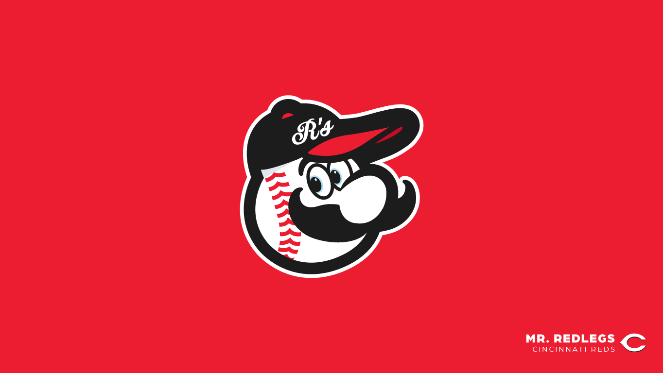
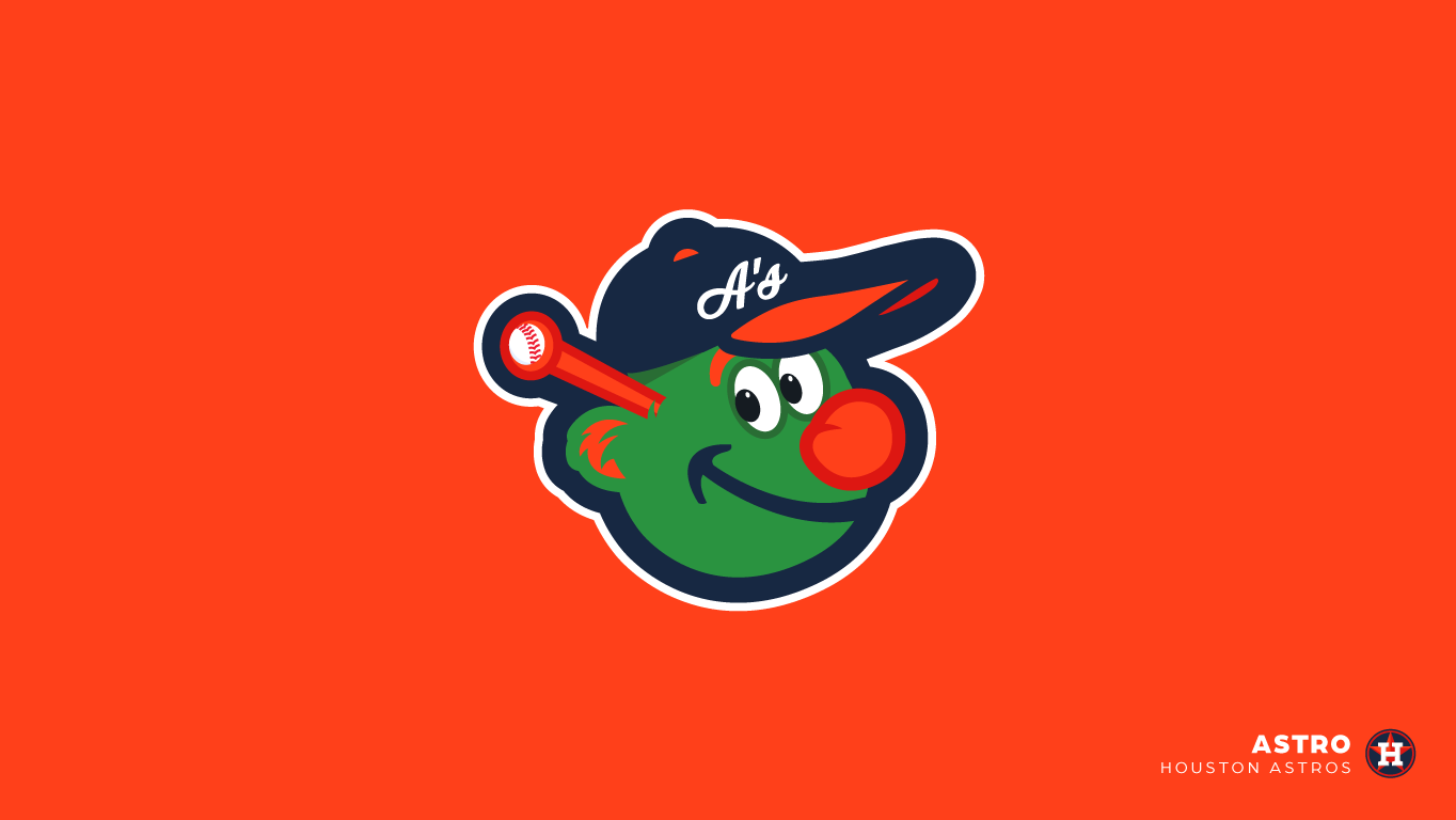
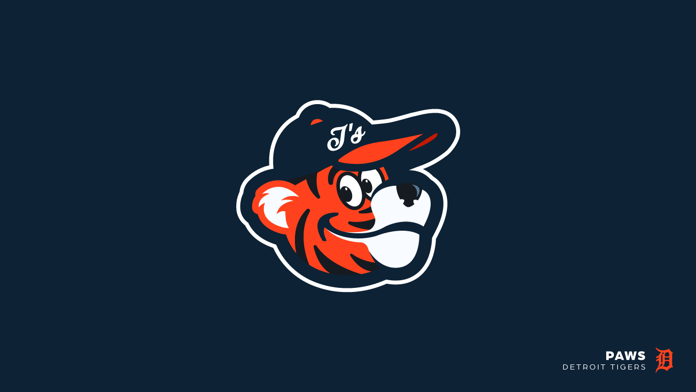
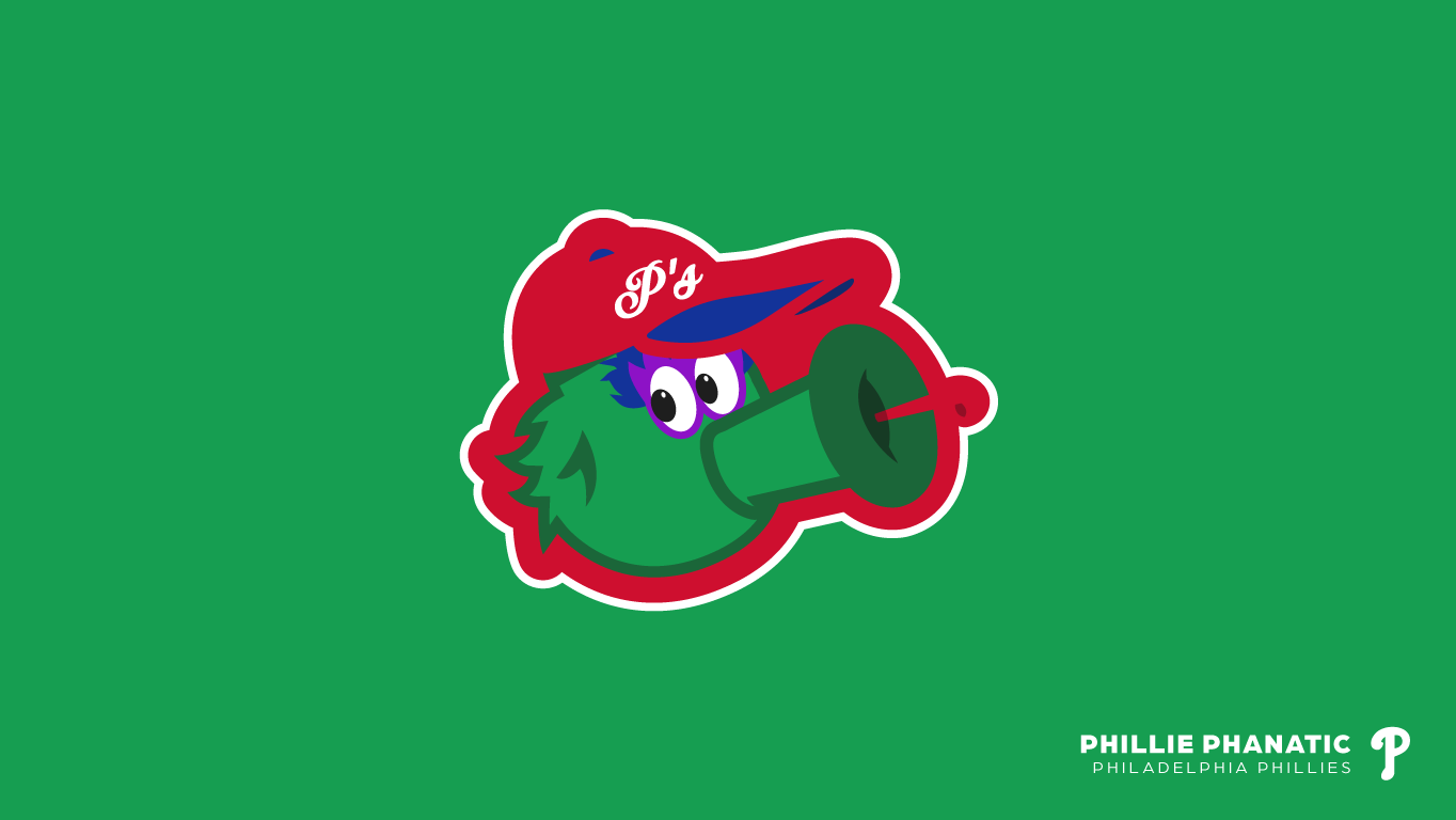
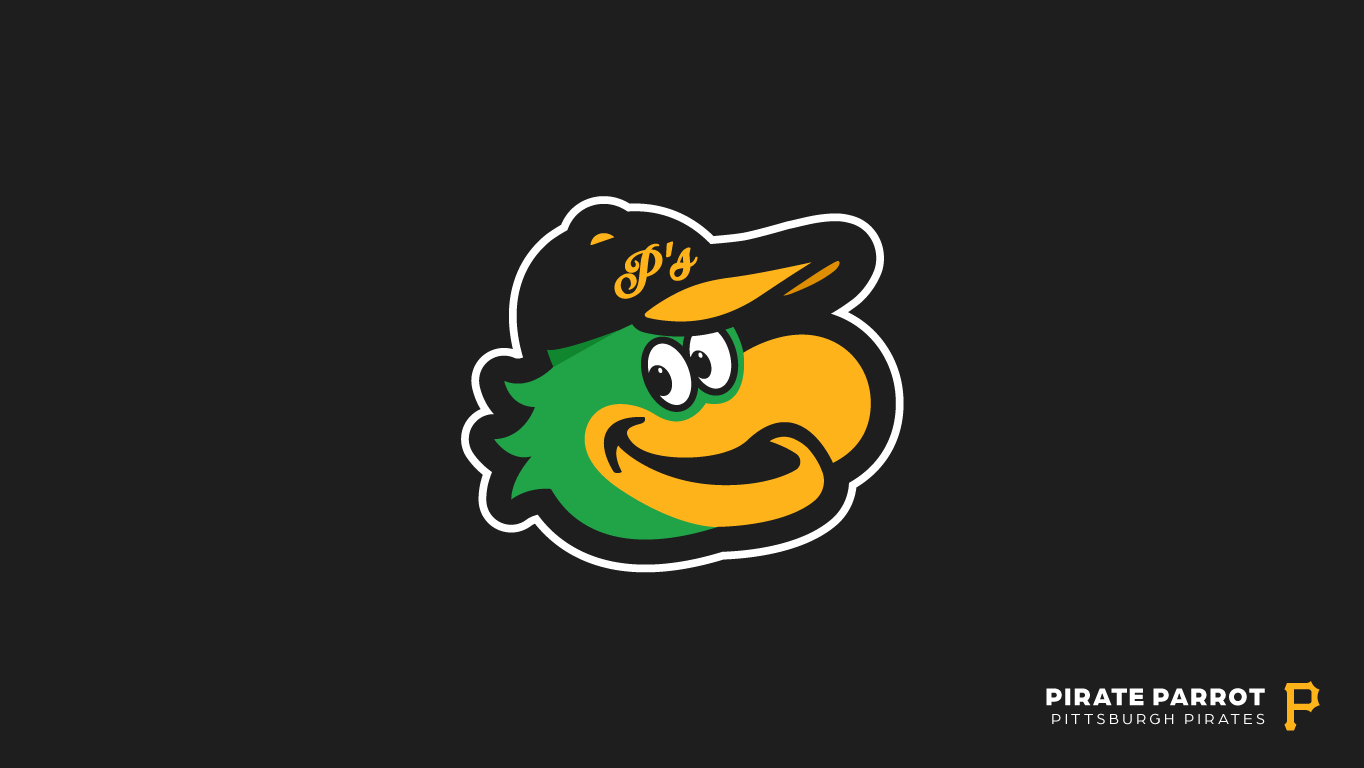
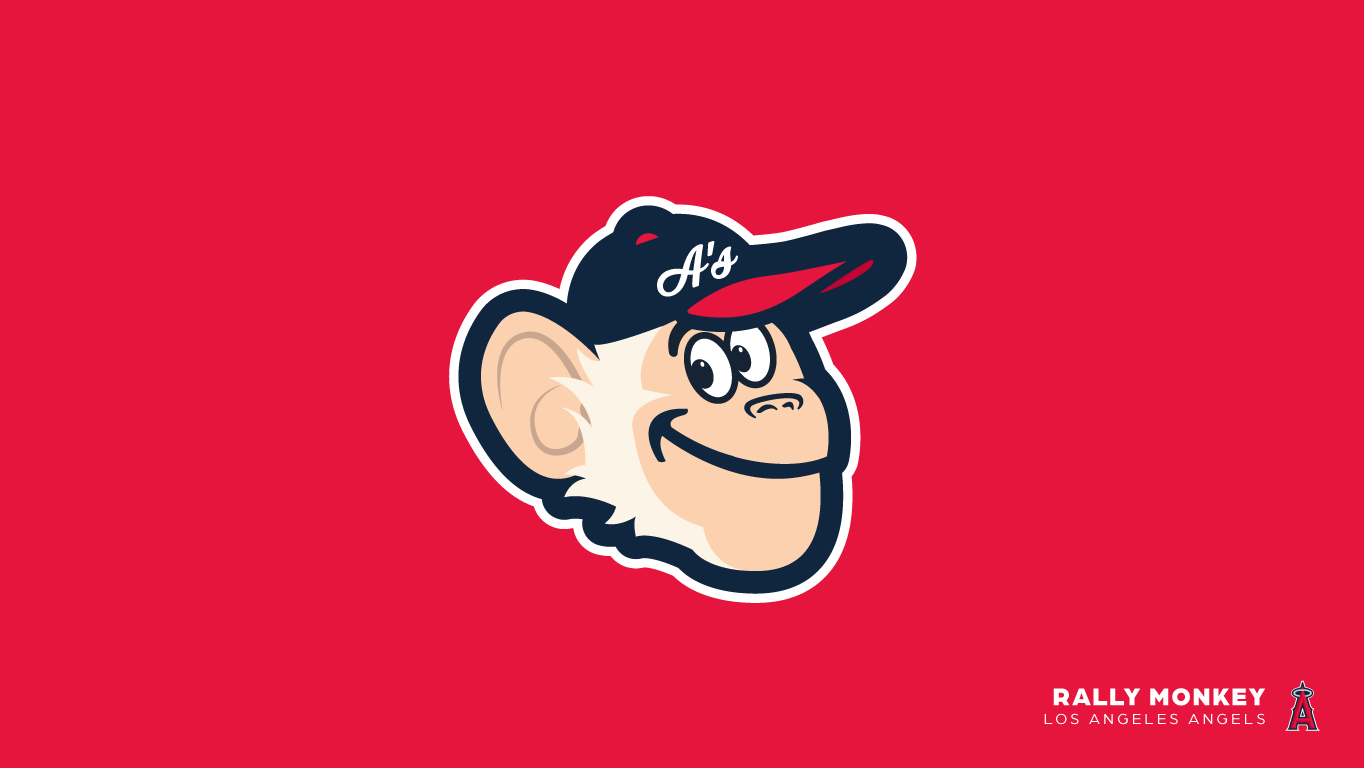
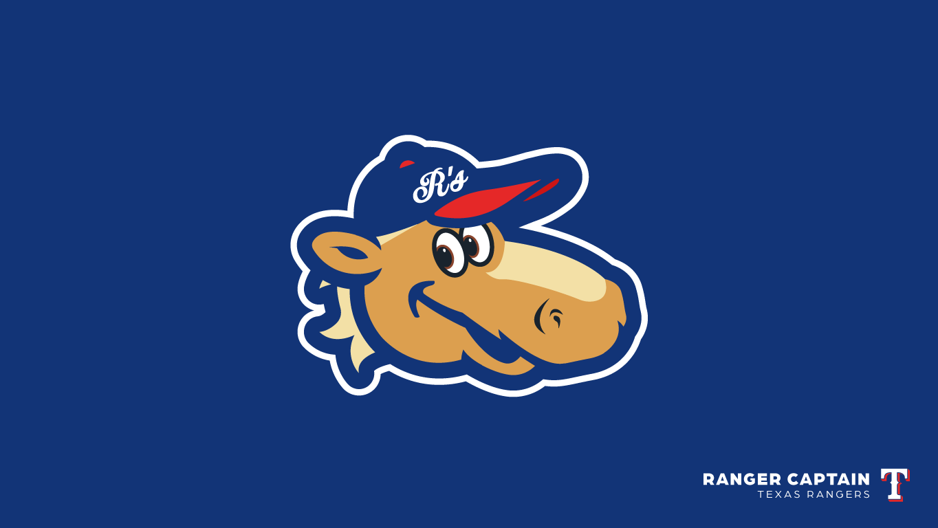
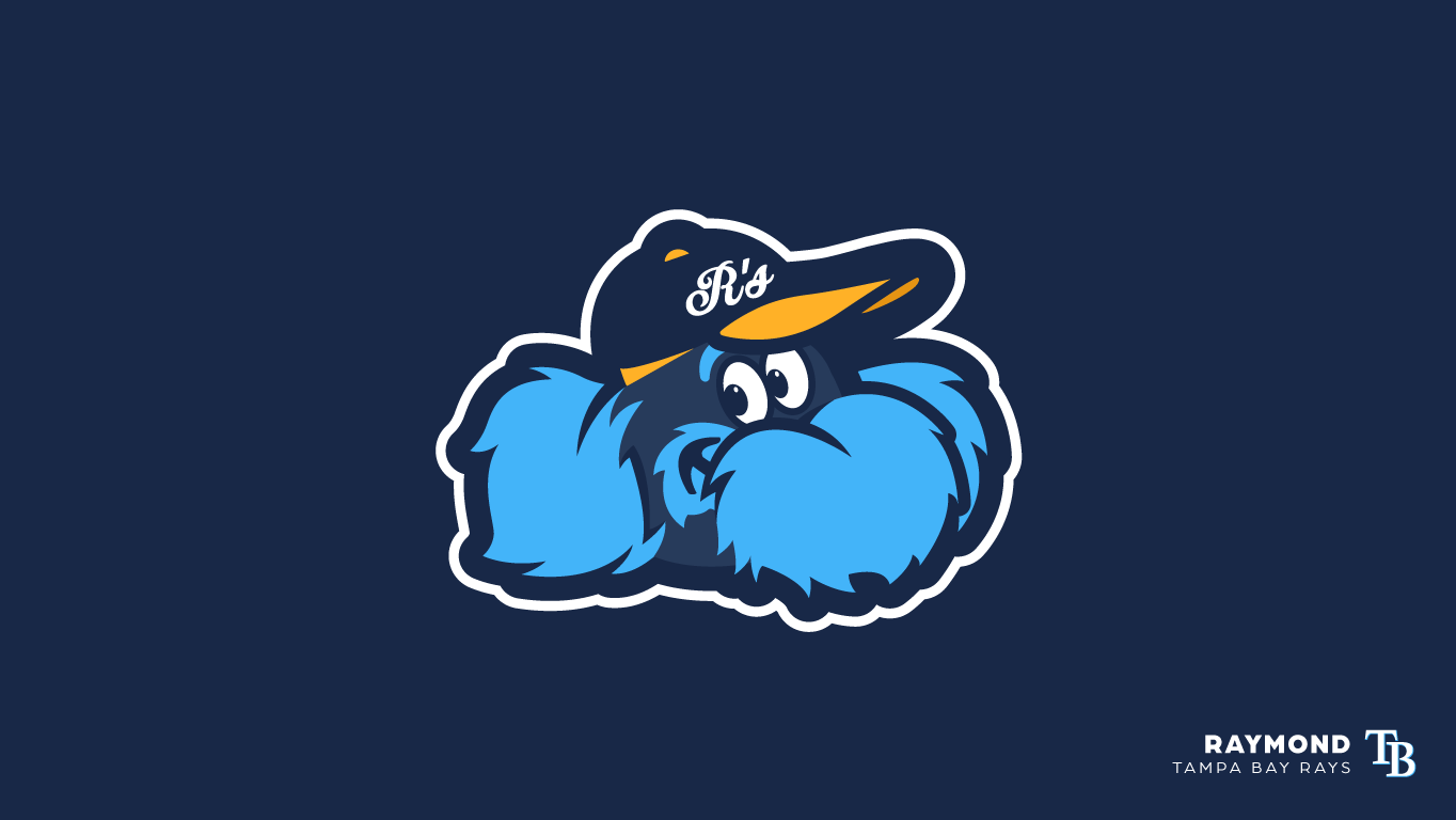
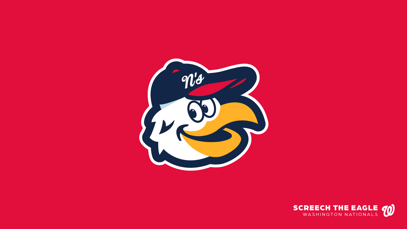
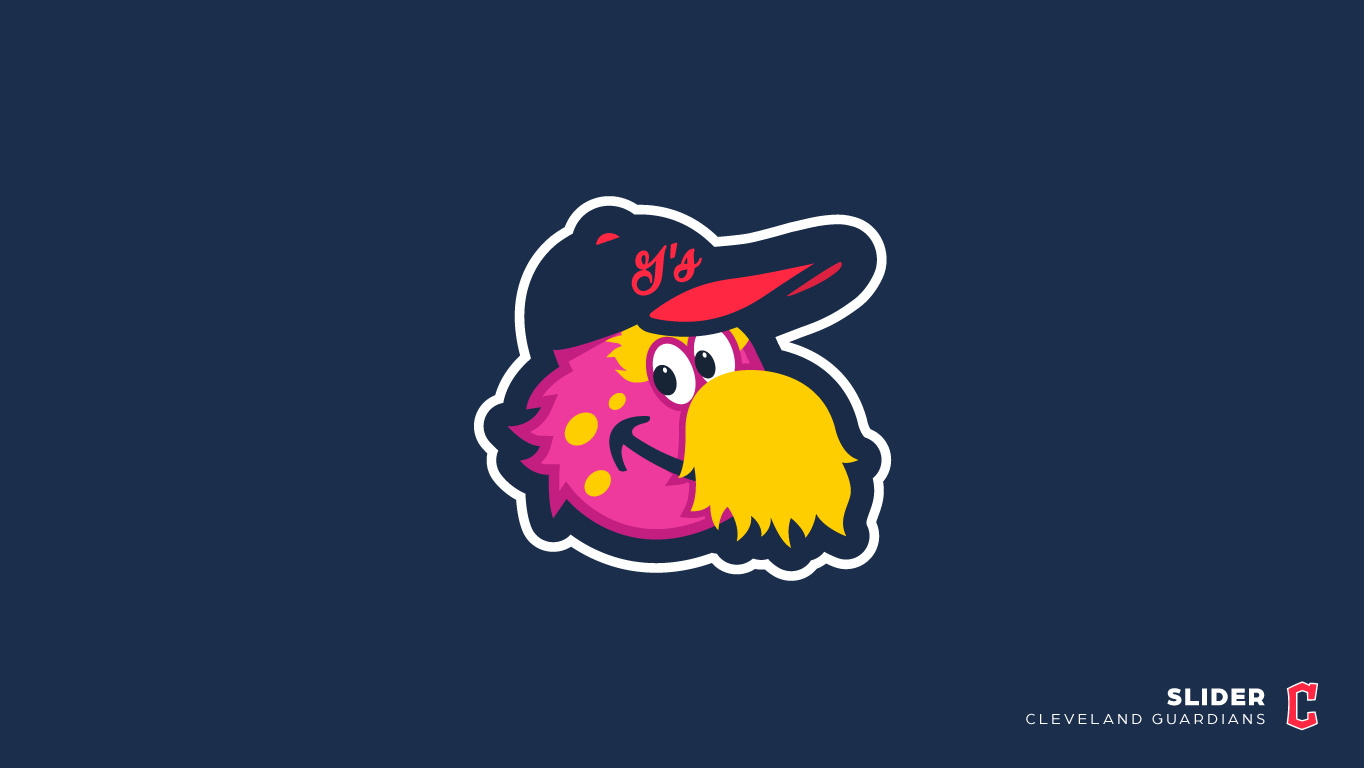
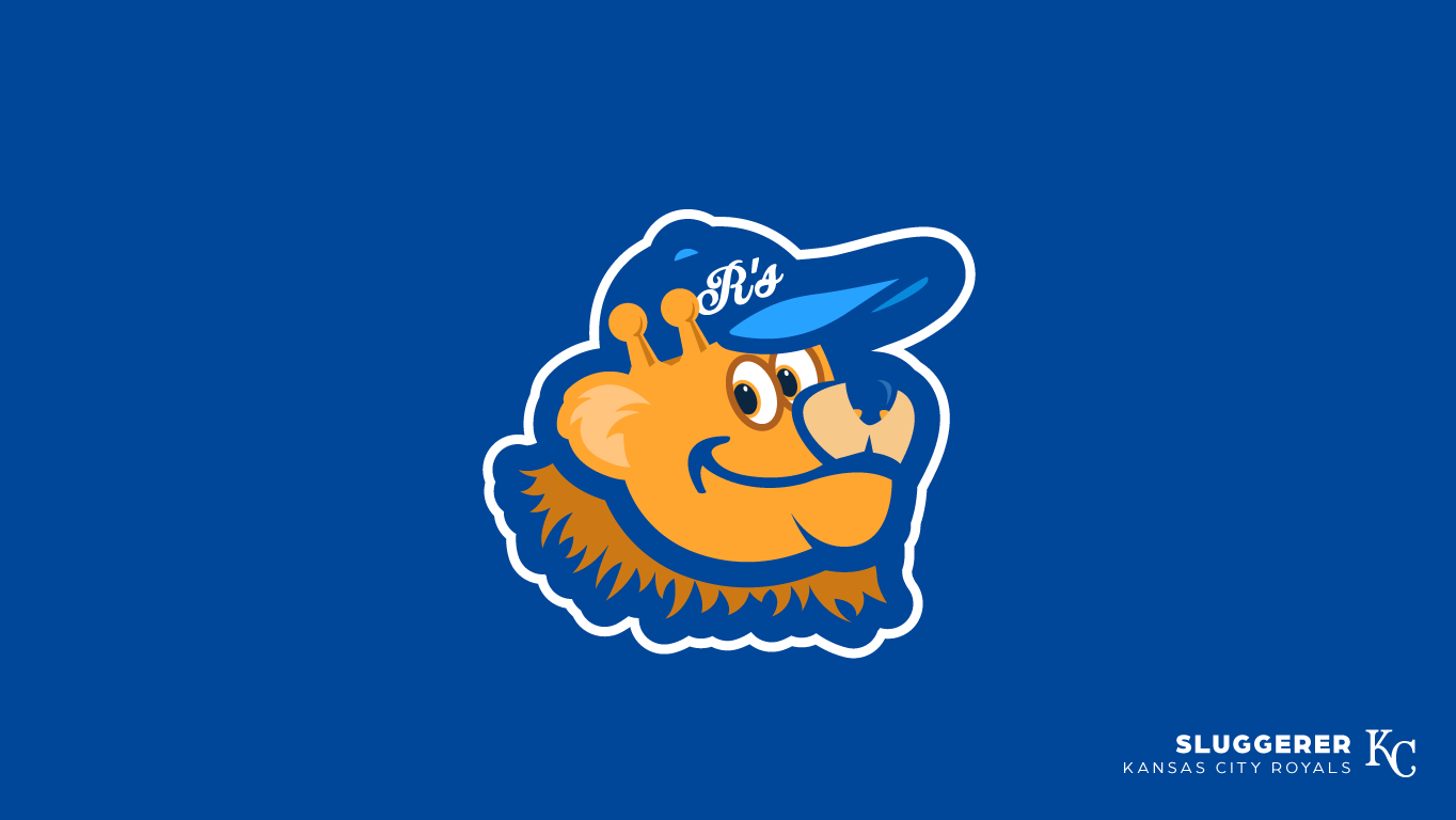
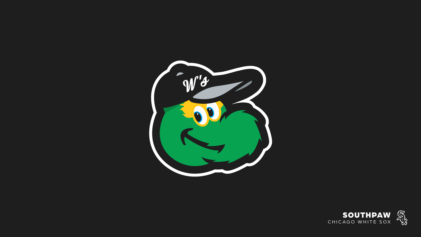
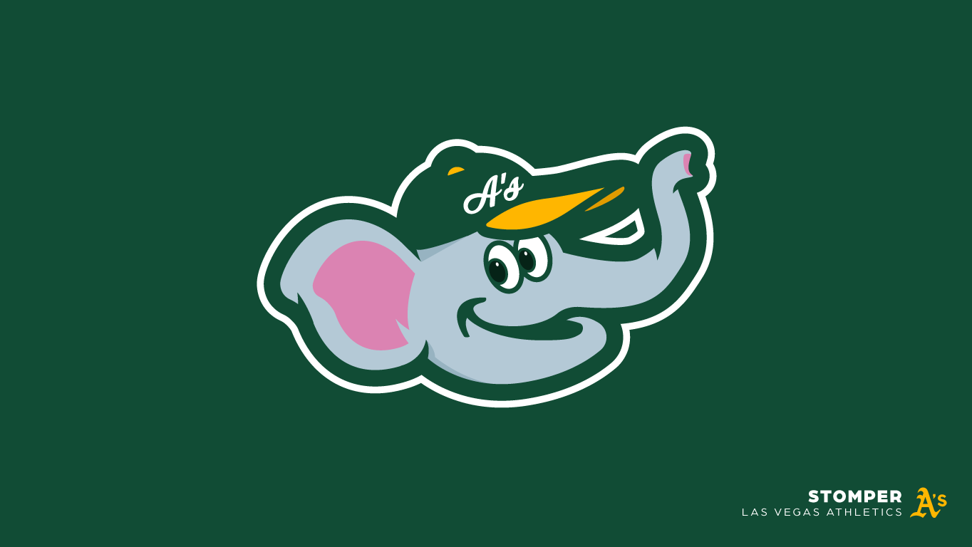
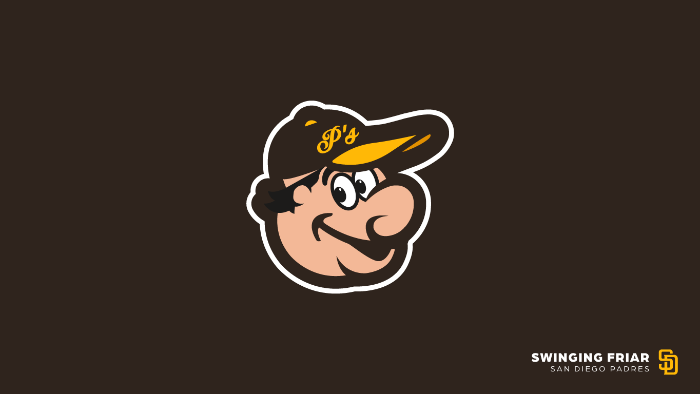
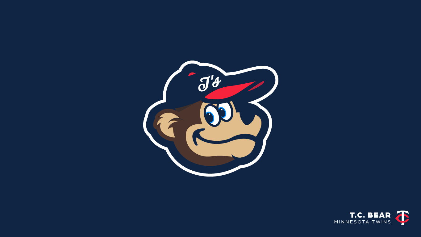
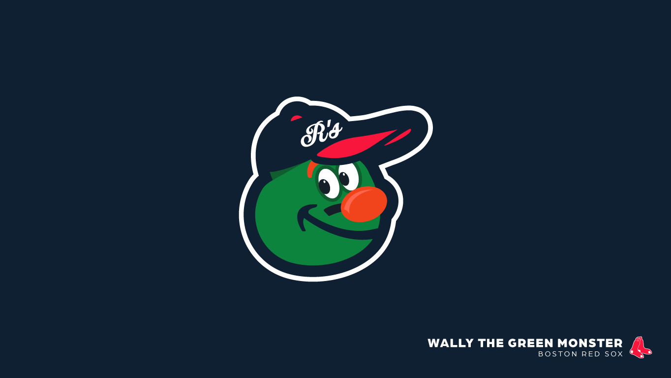
With all the historical information provided above, I thought to myself - What if EVERY Major League Baseball team had their own version of the Oriole Bird Logo. Surely these beloved mascots deserve a little bit of love and appreciation. So I leapt into action and went to work designing logos similar to the famous Oriole Bird Logo.
From the Phillie Phanatic, everyones favorite green fuzzball with eyes, to Dandy the Yankees mascot, who lasted roughly 5 years & was designed to appear similar to that of former Yankee catcher Thurman Munson. Every major league mascot from every major league club is represented below in their lovable, laughable and entertaining glory. As a fan of baseball, this project was an absolute joy to design and produce. Enjoy!
30 MLB teams - 30 lovable mascots - 1 distinctly iconic style.
