Redefining the DC Brand
January 21, 2021
January 21, 2021
Since I was young I have always been fascinated by comics, from the style of storytelling; how you can read only a few pages and feel like you can actually hear the sites & sounds coming from the pages like if you were watching a movie to the various of unique artistic styles from some of the great DC comic book artists like Curt Swan, Jim Lee & Jack Kirby. Each artist having their own unique ways of interpreting and each and every character they draw, while still being able to convey the sense of movement, action and emotion by simply using a pen and paper.
Now as an adult, the comic book world has expanded & grown into an industry that funds not only comic book but live action motion pictures, animated movies & streaming services simply dedicated to bringing more of our favorite super heroes & super villains to life. Although the movies for DC Comics, better known as the DCU, haven’t gone on to be blockbuster hits like their main rival Marvel(MCU), this doesn’t mean that DC Comics can not turn things around one day. As a designer, I like to think that I the heart of every great business is a great brand, and for me a great brand starts off with something most people don’t pay any attention to; their logo.
The History
To understand the logo, first we need to know the history about the logo itself. Detective Comics has been around since 1934 when writer Malcolm Wheeler-Nicholson founded National Allied Publications & published the first comic book to feature new comic strips that weren’t previously seen in newspapers. Three year later, in 1937 Wheeler-Nicholson partnered with two well known magazine distributors, Harry Donenfeld and Jack Liebowitz, and together Detective Comics, Inc. was founded. During that time DC published their first Superman story in Action Comics №1, and with its overwhelmingly commercial success it led to the creation of the superhero genre and most Detective Comics best known heroes. Introducing the other two members of their Big 3 — Batman in 1939 and Wonder Woman in 1941, the success of these characters were amplified by Licensing Corporation of America. Leading to the creation of Superman Inc., which marketed DC’s entire roster through all ranges of products & oversaw the use of is characters in all other forms of media.
Throughout the 1950’s, Detective Comics & the popularity of superheroes took a dive, even though comics featuring Superman, Batman & Wonder Woman were still popular — DC decided to venture into different genres such as science fiction and westerns. But in 1956, they began showcasing superheroes once again when writer Robert Kanigher and artist Carmine Infantino introduced The Flash Showcase №1–4. Thus ushering what’s known as the Silver Age of comics. Leading to more DC Comics heroes like Green Lantern & Hawkman and ultimate rise of rival companies, most notably Marvel Comics. Wheeler-Nicholson was later forced out of the company however, due to his inability to repay his debts, after a series of mergers that in turn led to the name changing to National Periodical Publications (NPP)which was later purchased by Warner Brothers — Seven Arts in 1969.
From the 1970 and part of the 1980’s, Detective Comics saw much success from their comic book stories. Writer Dennis O’Neil and artist Neal Adams introduced a new level of maturity to the superhero genre with Green Lantern/Green Arrow crossover, a comic which featured stories that dealt directly with social issues such as race relations, pollution, and drug abuse. But by 1985, most of DC Comics stories begun to feel too cumbersome and confusing for it’s readers, leading to the 12 issue Crisis on Infinite Earths, written by Marv Wolfman and artist George Pérez to essentially reboot the universe with new and exciting iterations of everyone's favorite superheroes while keeping the older previous stories in the lore. With that, the characters were reborn allowing for writers like Frank Miller to bring Batman’s early stories as the masked vigilante in Batman: Year One which followed his much older, more grizzled Batman in Batman: The Dark Knight Returns.
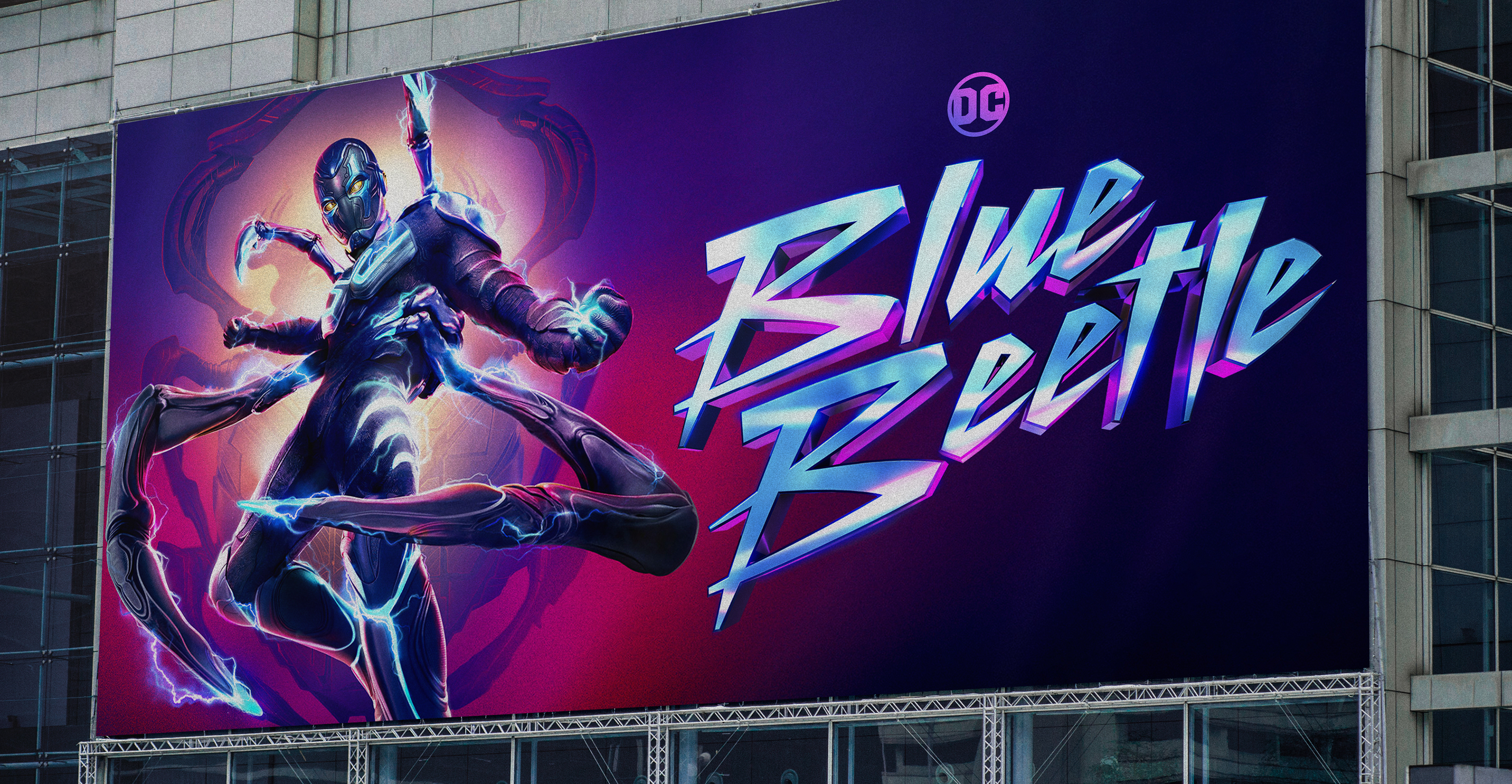
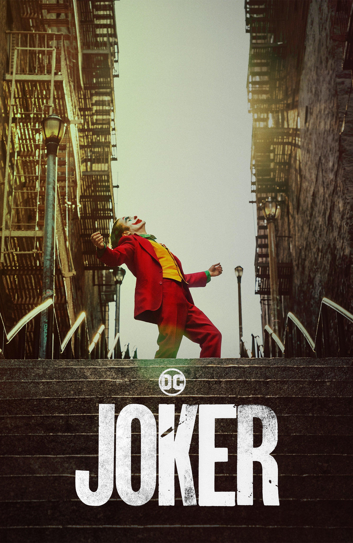
By the late 80’s & early 90’s DC Comics was venturing into story telling beyond paper and pen, live-action motion picture films were being produced with Christopher Reeves as the Man of Steel in Superman (1978) & one of Michael Keaton’s first serious roles as the dark knight in Batman (1989). Since then there have been and endless list of live action films bring most of DC Comics superheroes & supervillains to life, with the latest being James Gunn’s twisted take on The Suicide Squad (2021), Joaquin Phoenix as JOKER (2019) and the much anticipated release of the DCU's first movie in Blue Beetle (2023).
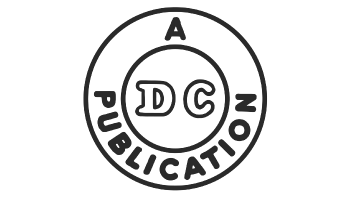
1940: The first Detective Comics logo appeared showing a clean & simple black outlined logo with its iconic DC an abbreviation.
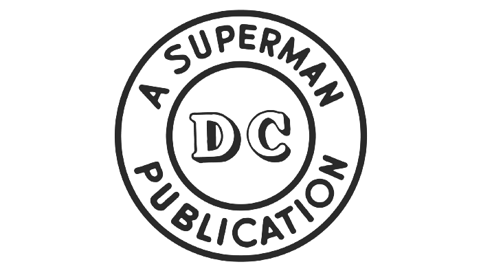
1942: Two years later Detective Comics made their first change by giving the DC logo a 3D look and adding the title SUPERMAN to their logo.
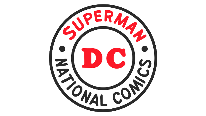
1949: Detective Comics changed their logo again by renaming it Superman National Comics making Superman & DC in red.
1970: Detective Comics went with a yellow rectangle outlined in black, with DC Superman & above Superman inside a circle.
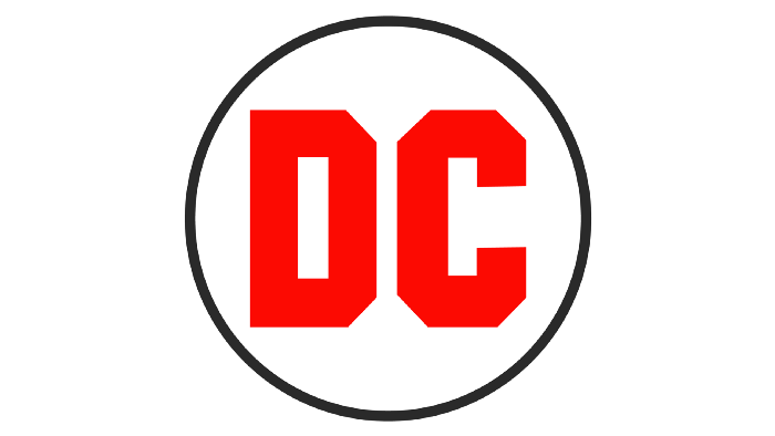
1972: Detective Comics adjusted their logo to be more simplified, by implementing the use of a red DC logo inside a black ring.
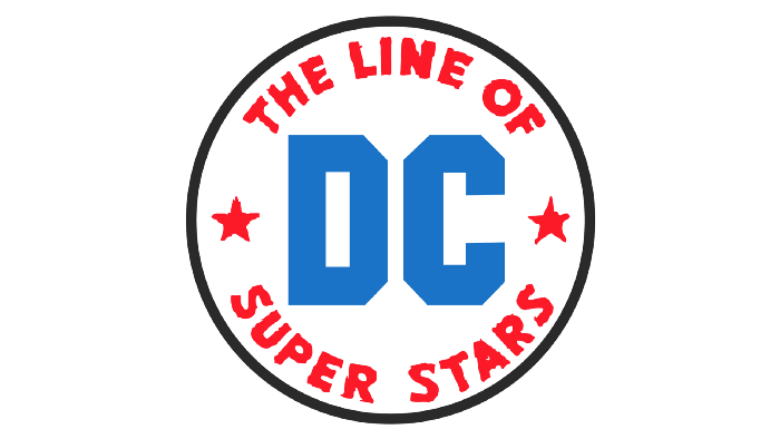
1974: Detective Comics later replaced the red logo for a blue one center between a words that said The Line of Super Stars.
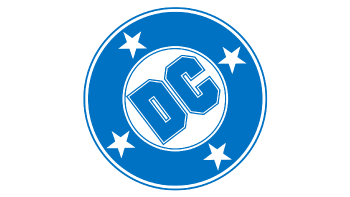
1976: Known as the DC Bullet, this logo was designed by Milton Glaser. It contains the blue DC logo with 4 five pointed stars.
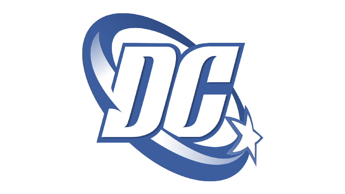
2005: Created by Josh Beatman and Richard Bruning. The DC Spin logo is the first all blue logo with one star spinning around.
2012: Lasting only 4 years, this logo has a black C with a blue D shaped sticker with the company name
DC Comics underneath.
DC Comics underneath.
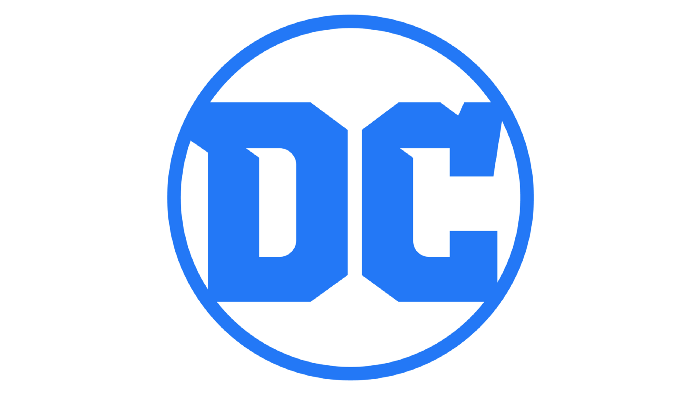
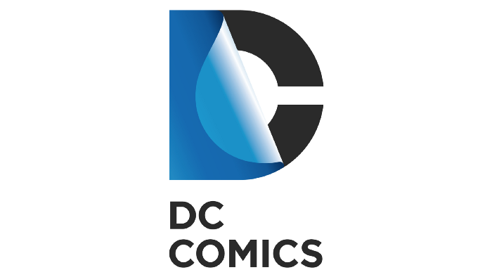
2016: The latest & current DC Comics logo contains a modern serif style DC font in blue, inside a thin circle with the same color.
The Problem
When the current logo for DC originally came out, I was a big fan of it. It was a simple, clean and appeared to be perfectly symmetrical. But over time, I began to to notice flaws in their seemingly simple design, flaws that would probably not be noticed by the everyday person.

1. The first flaw was that both letters are not in the middle of the blue circle, making the center vertical line in the middle of the circle closer to the letter D, making the letter D appear wider than the letter C.
2. The second flaw is the height different of where the bottom left part of the letter D meets the blue circle compared to where the bottom right part of the letter C, making the letter C appear wider than the letter D.
3. The third flaw is how asymmetrical the top out corners of the D & C letters are — the letter D appears to go horizontally towards the left, while the letter C goes vertically upwards.
The logos lack of parallel symmetry it causes the logo to feel unbalanced, the amount of negative space between the letters and the circle caused by the fluctuation of the connecting points make it feel uneven or heavy. Overall due to all the major and visible flaws, I wanted to tackle this logo head on and see if I could design a logo that fixes all of them.
THE PROPOSAL
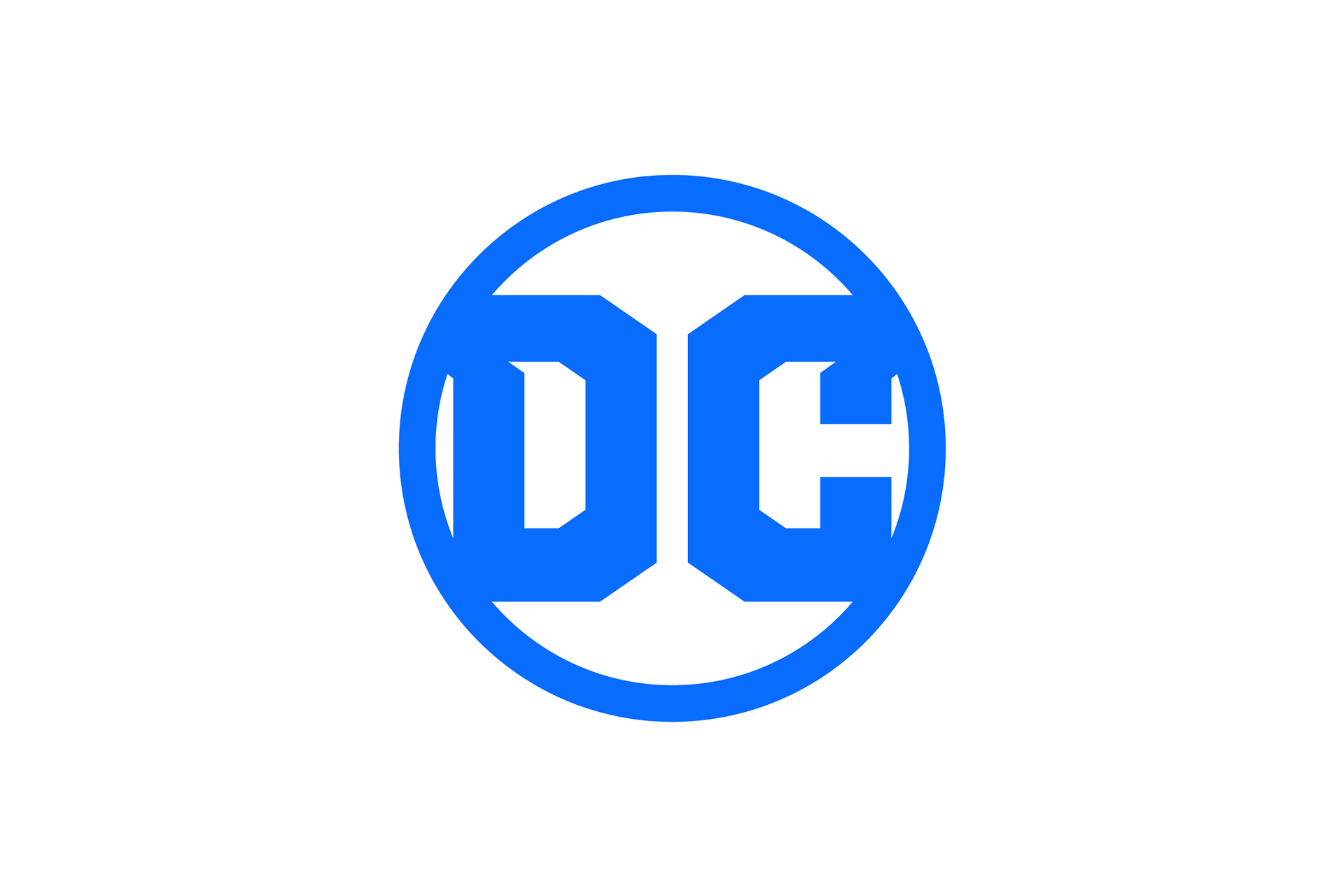
My proposed logo concept corrects the flaws & asymmetrical angles from the previously designed logo. The first thing I wanted to correct was to make the letters equal, by giving them the same height, weight and width.
By making both letters equally parallel, they naturally create a clean and seamlessly symmetrical points that both go horizontally away from each other. Along with that, I decided to flip the pointed inner end of the letter C to face outwards, also allowing the logo to feel much more equally balanced.
The second thing I wanted to tackle, was where the outer lower ends of the letters would connect with the outer circle. By equaling the width of both letters I made them connect at the same point on opposite ends of the circle. Plus making the circle thicker, it gives my proposed logo a better sense of balance while also keeping the amount of negative space to an equal minimum.

Throughout my design process, I continued thinking of new ways to improve and build on my proposed logo. In doing so, I began to work on the unseen aspects of the D & C letters that make up the logo by making the top left & right of each respective letter equally shaped.
By equally shaping them, each letter has the ability to live freely without the need of the blue outer circle — allowing me to create an entire font family which is available for purchase on Creative Market designed to match my proposed logo concept. This font would be used for all DC related daily news program, article interviews, animated & live action movies, TV shows, trailers and classes to have all have uniformed look.
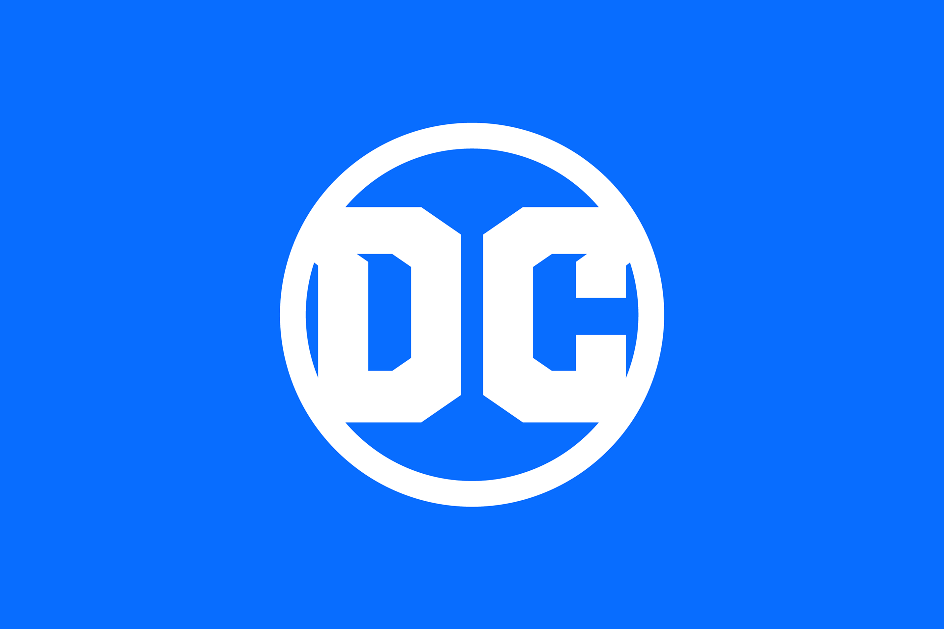
For the final touch I wanted to also add a small color range of blues to help accentuate the DC Comics brand. By adding the navy blue/anvil type color I felt it gave appreciation to the darker feel and tone the DC Comics always had in characters such as Batman, Black Adam and Darkseid. By adding the lighter powder blue/sky color I felt it gave a sense of hope, freedom and prosperity similar to what characters like Wonder Woman, Shazam and Power Girl. Both colors fit nicely with the newer, brighter and slightly richer tone I chose for my proposed DC Comics logo.
The Conclusion
Although the current DC Comics logo has clear & obvious flaws that as I point out above, at the end of the day it’s not a terrible logo. With minor tweaks and a little bit of love the current logo could end up being a much cleaner more symmetrical allowing for the brand to continue building and evolving, similar to what the company has done for the last 80 years.