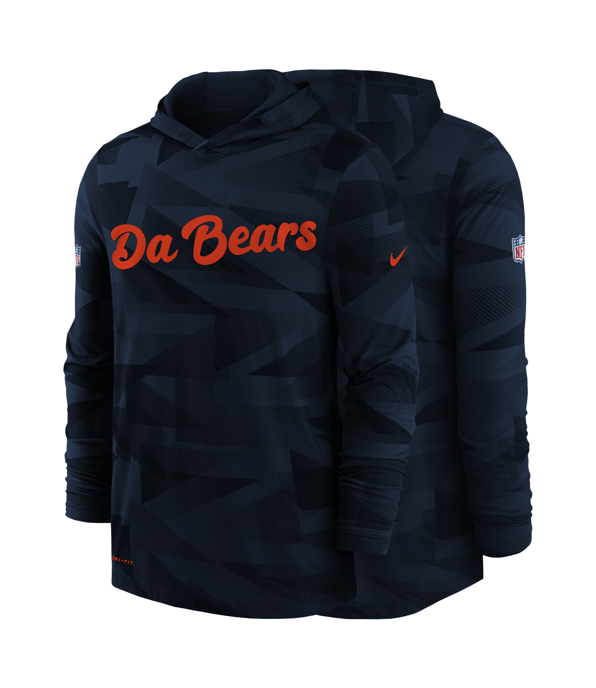
Chicago Bears: Branding Identity
Chicago, known to many as the Windy City, Chi-Town and the home to one of America’s oldest football teams; The Chicago Bears. Founded in 1920, originally named the Chicago Staleys was changed two years later to the name we all know and love. Throughout the 100+ years since then there have been an endless number of nicknames that NFL teams have had; from Purple People Eaters, New York Sack Exchange on defense to Air Coryell & Greatest Show on Turf on offense; none of these names have the long lasting success as Monsters of the Midway.
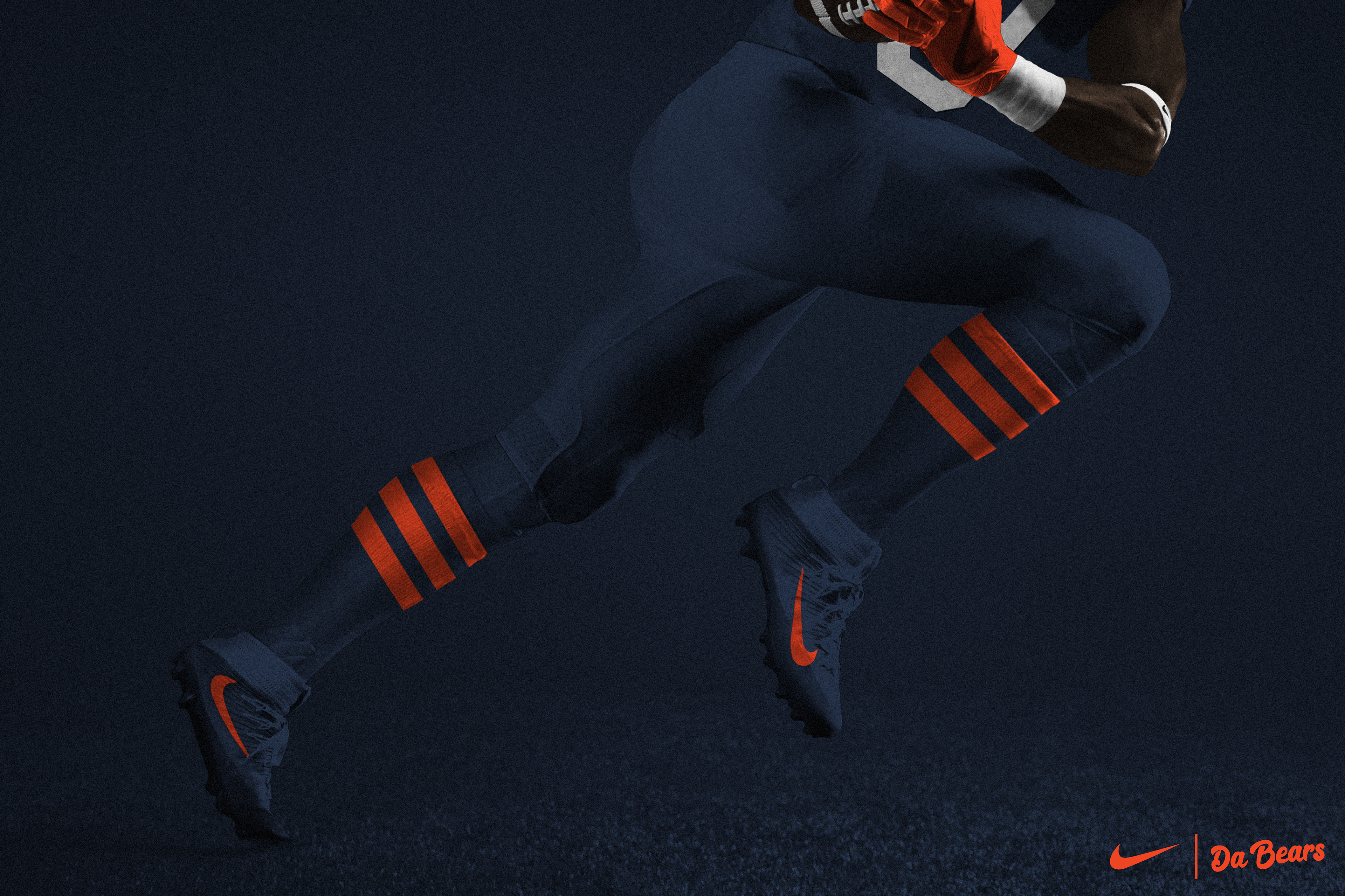
In 2019, with the NFL celebrating its 100th season, the Bears announced they were going to dawn a uniform the team wore in 1936. The uniform was unique due to it’s orange & blue alternating stripes from the lower shoulder all the way to the neck/collar. pair that with a solid retro block number font (something that the Bears haven’t used for any years), 3 striped helmet and orange striped socks. The uniform was a success and became the teams new signature throwback.
TEAM BRANDING
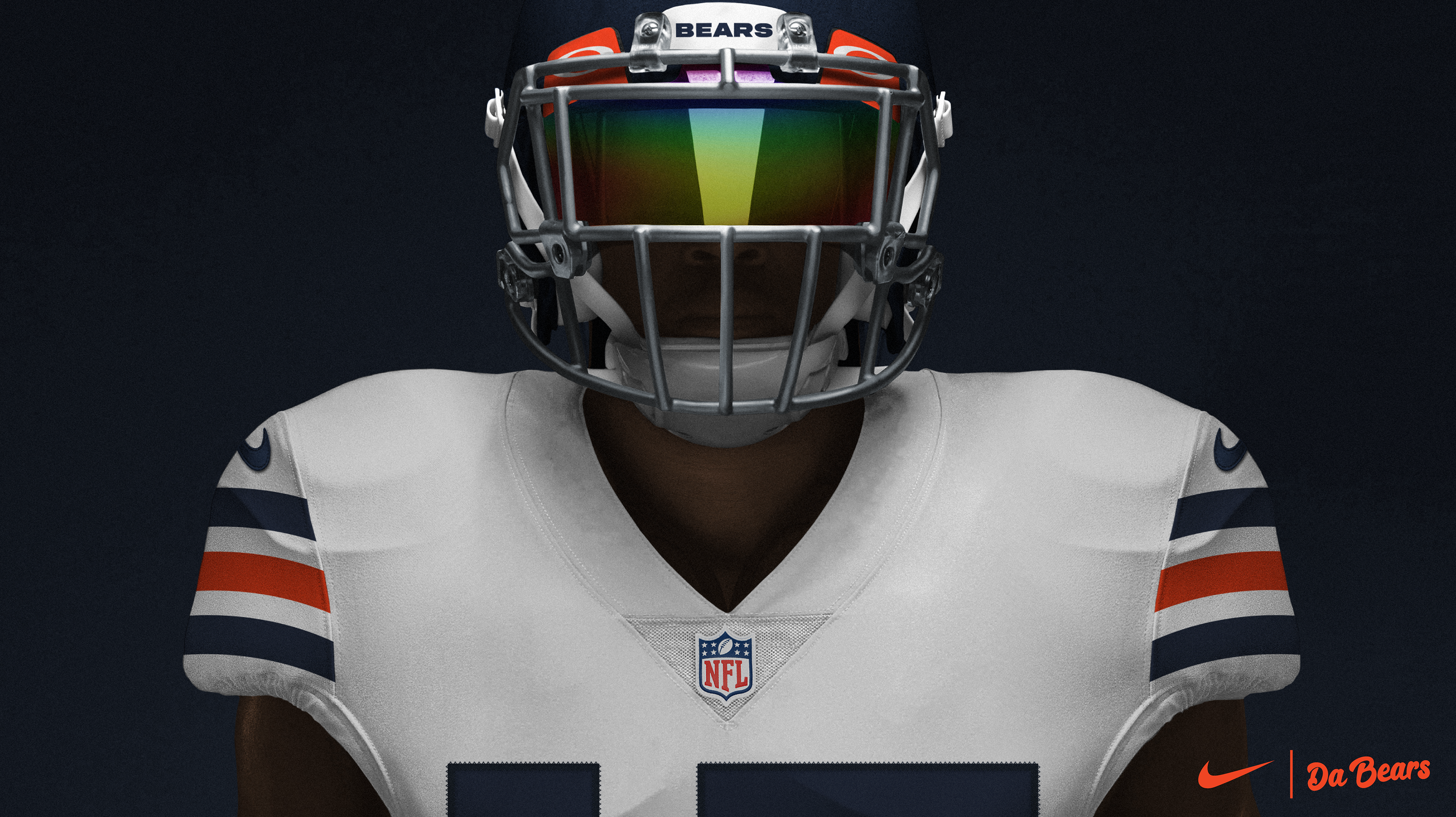
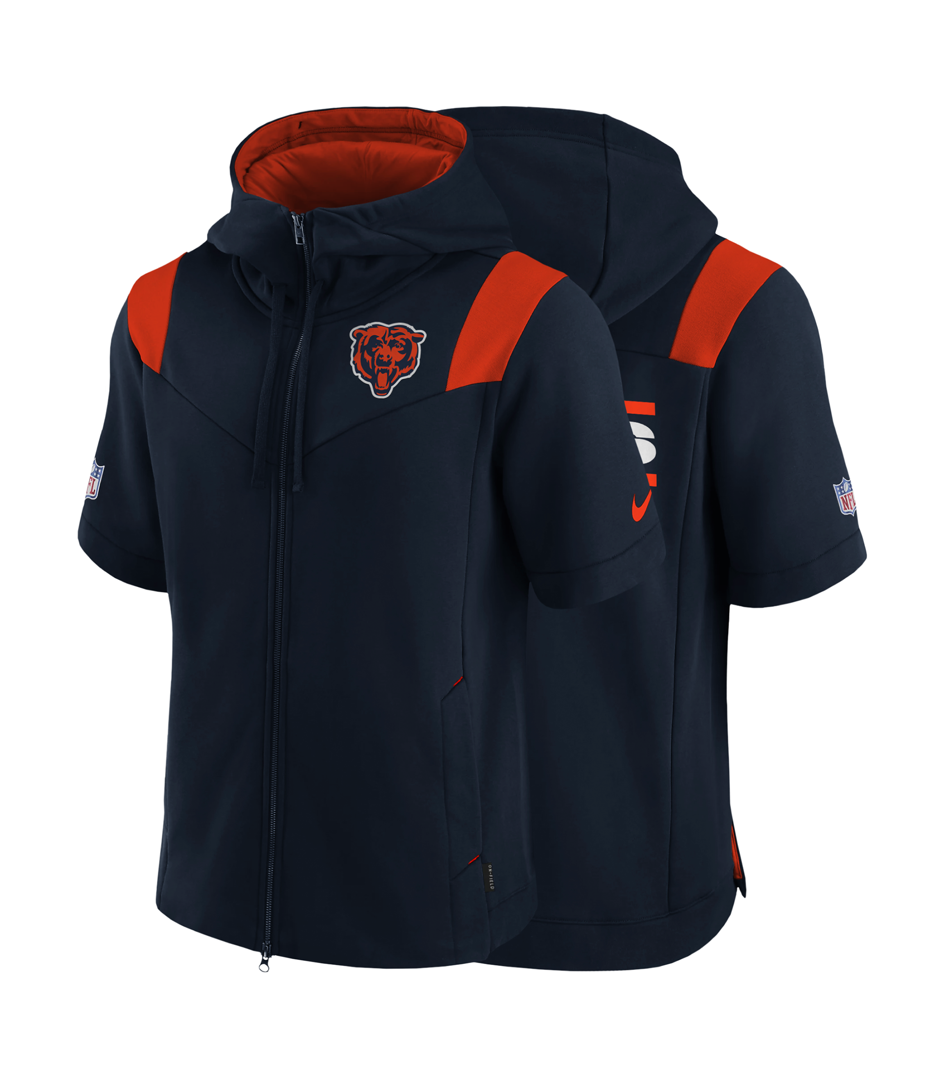
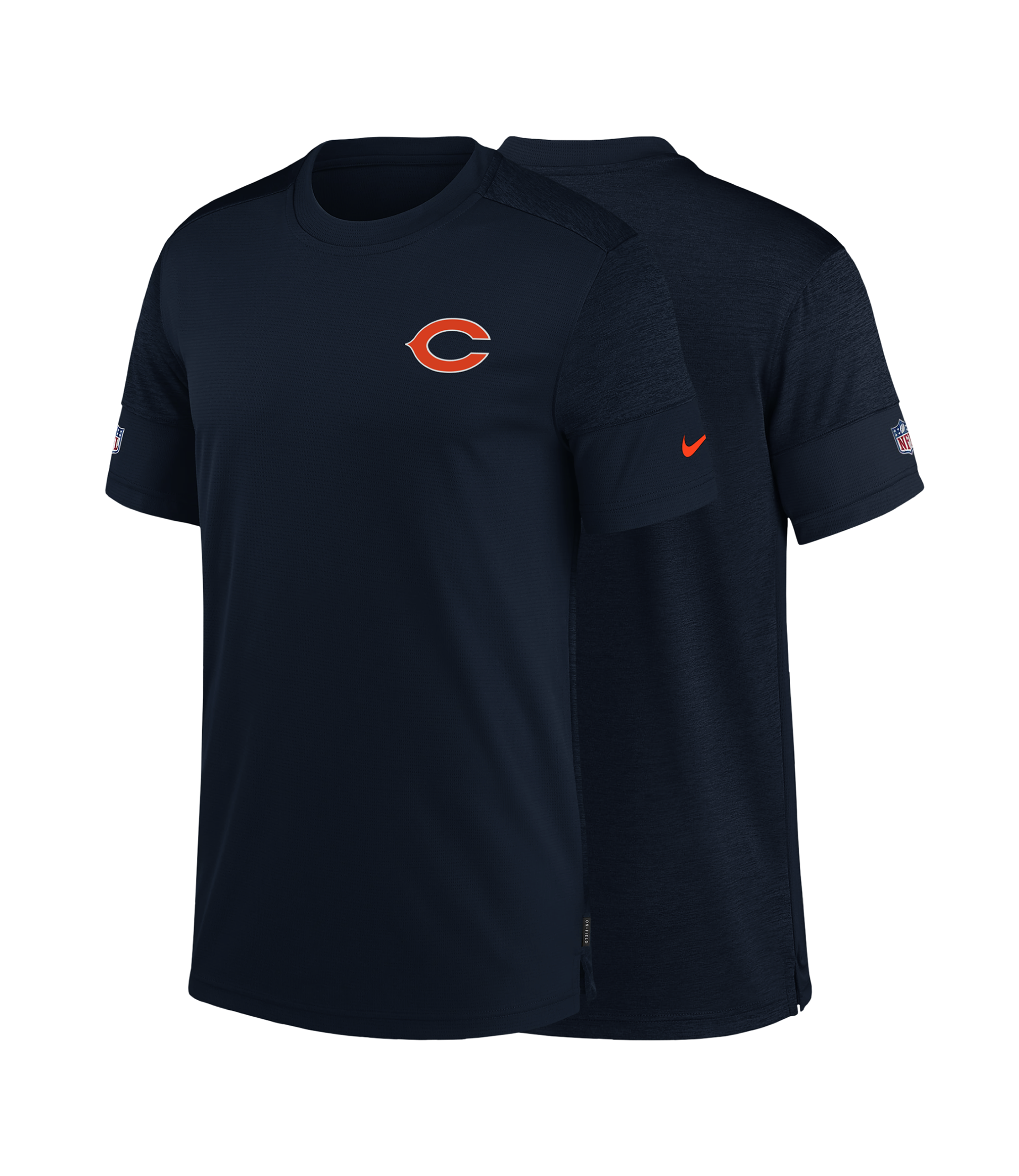
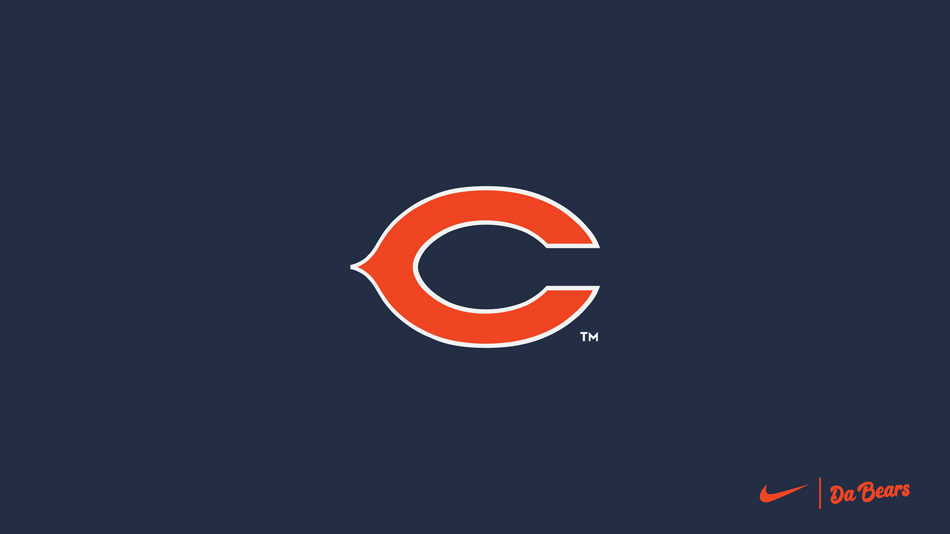
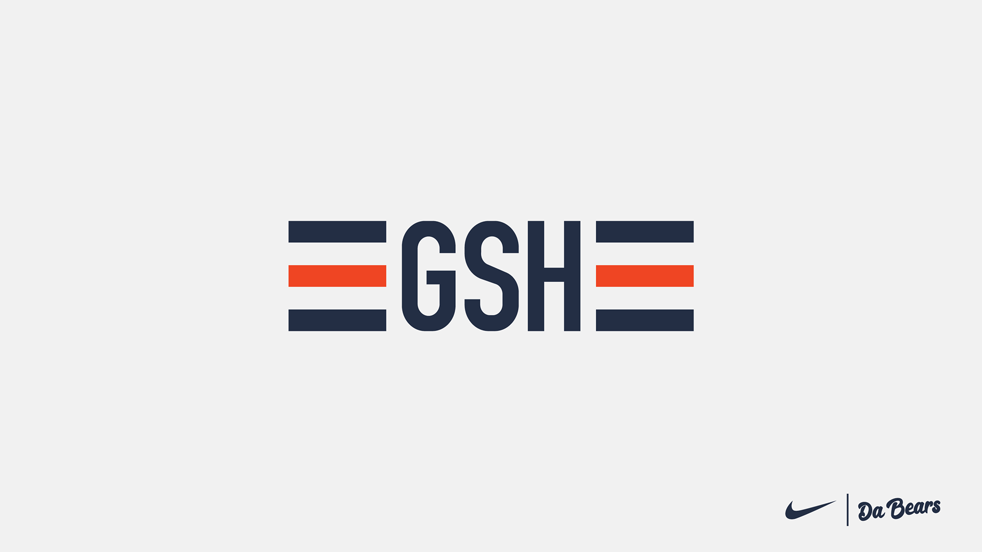
My main priority for with this rebrand was to make the their trademark wishbone C logo symmetrical and balanced. Making the C logo symmetrical allows for a more balanced look on the helmet as well as removing the blue border the logo had outlining the white outline. Along with cleaning up the C logo I wanted to the GSH(George S. Halas) memorial logo I simple and clean update, giving the logo three alternating stripes on either side to match the new alternating stripes on the uniforms.
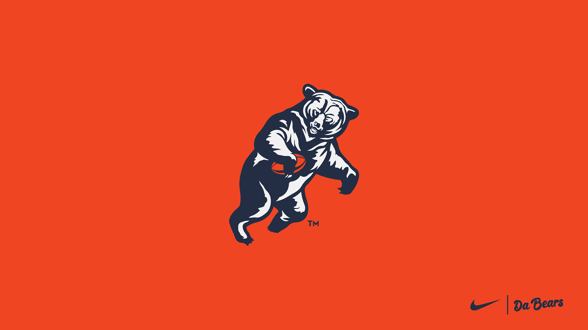
Keeping with the traditional logos, I want to reintroduce a logo from the 1940’s which has a bear standing up and a holding a football. This logo would replace the original yelling bear head logo as the secondary logo to the wishbone C logo. Same can be said about the new number font, taking the style of the 1936 retro uniforms numbers. I want to make the numbers standout, and not be so small as they are with the current uniforms.
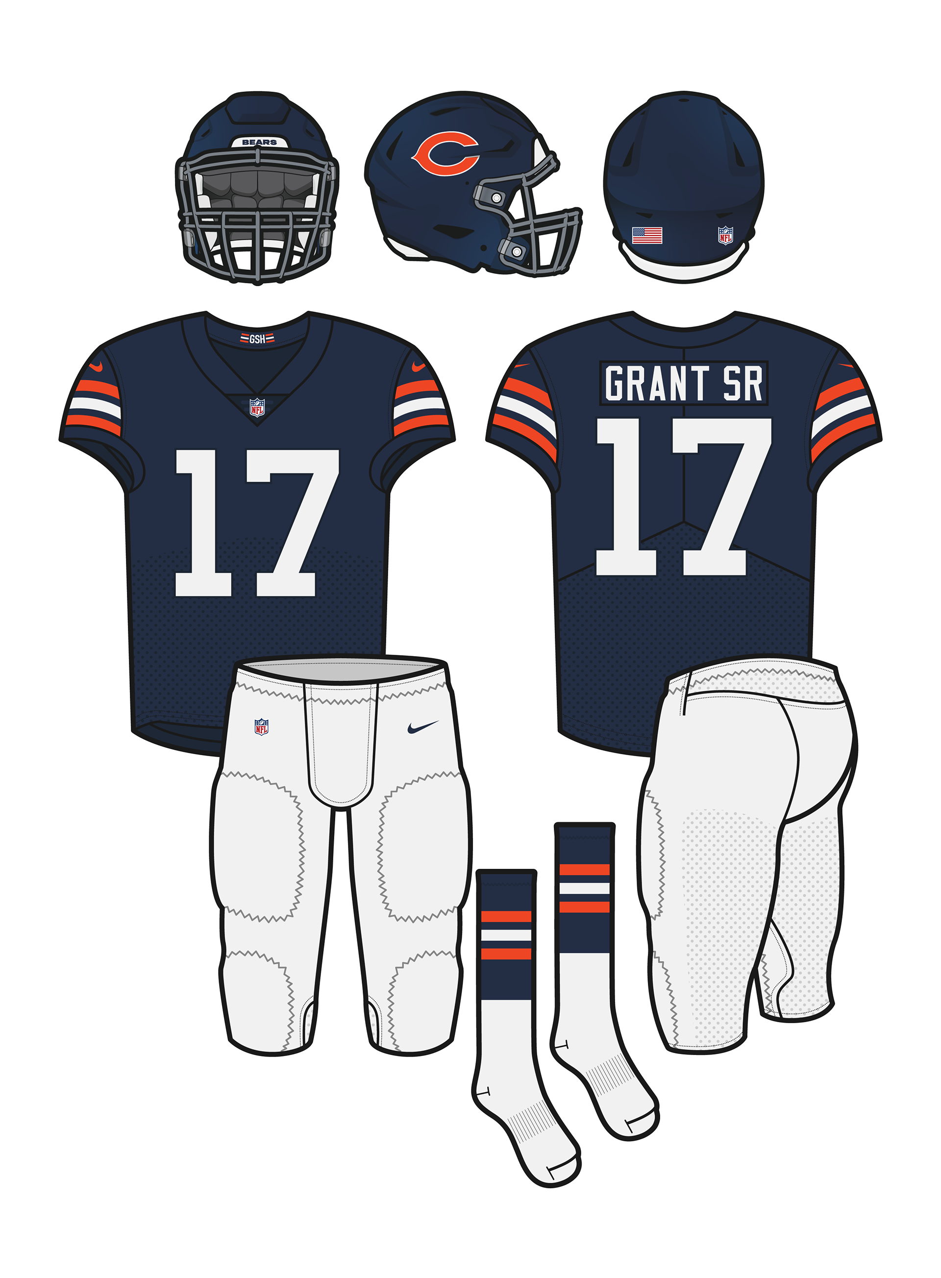
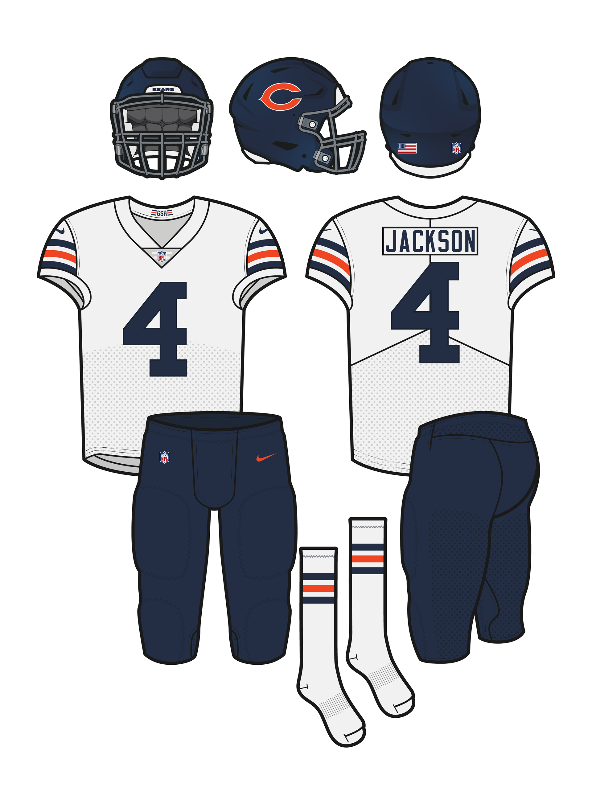
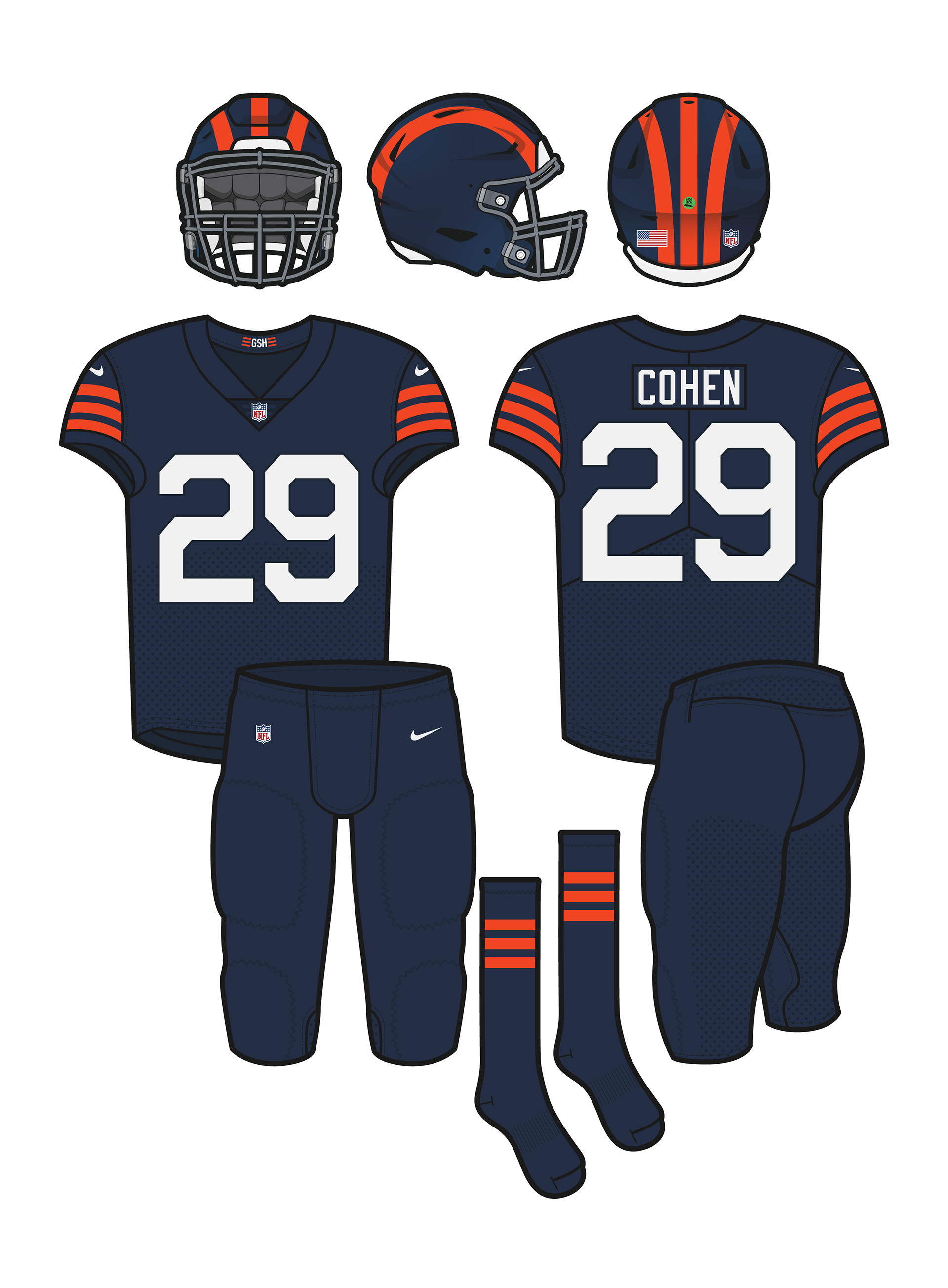
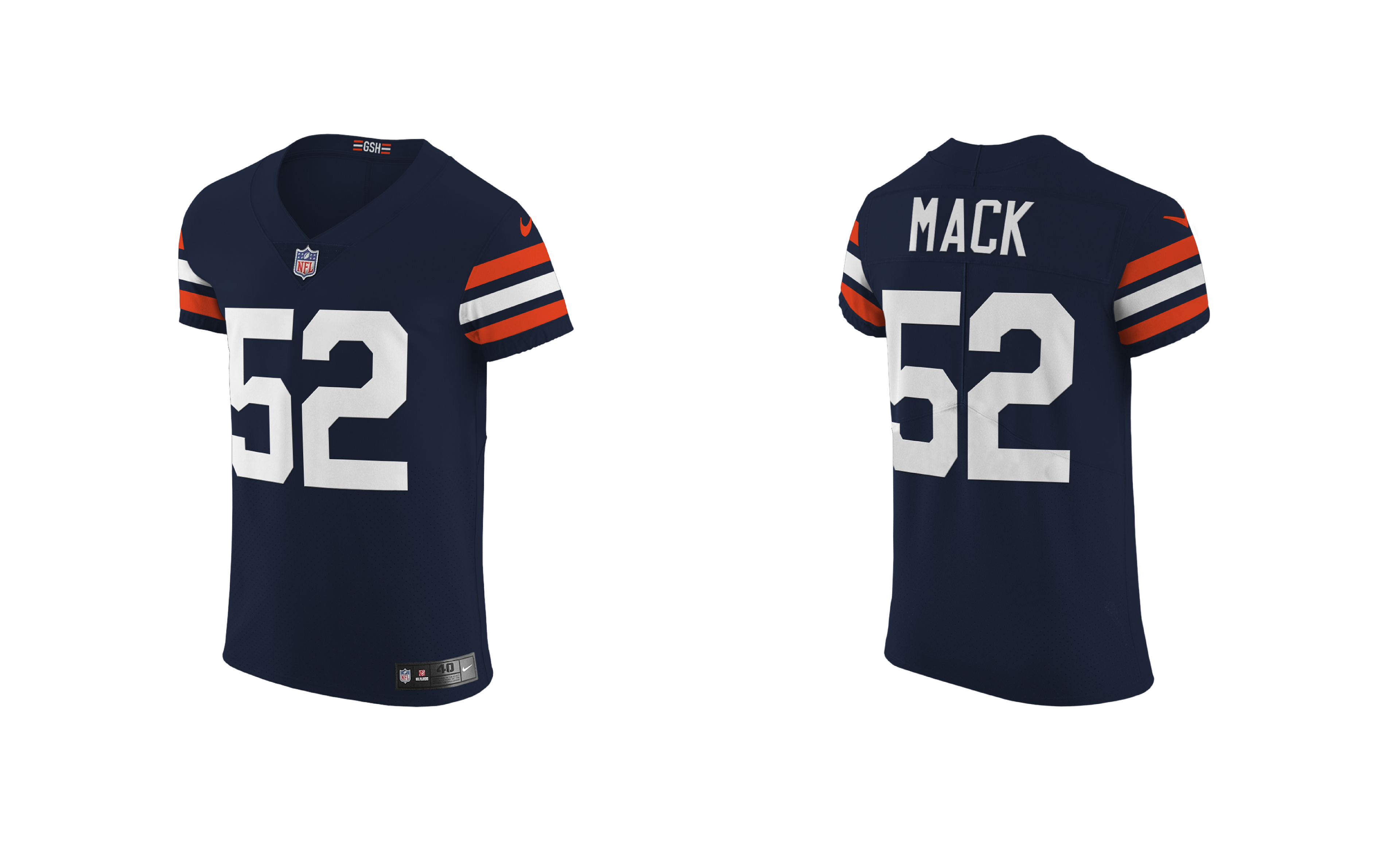
TEAM UNIFORMS
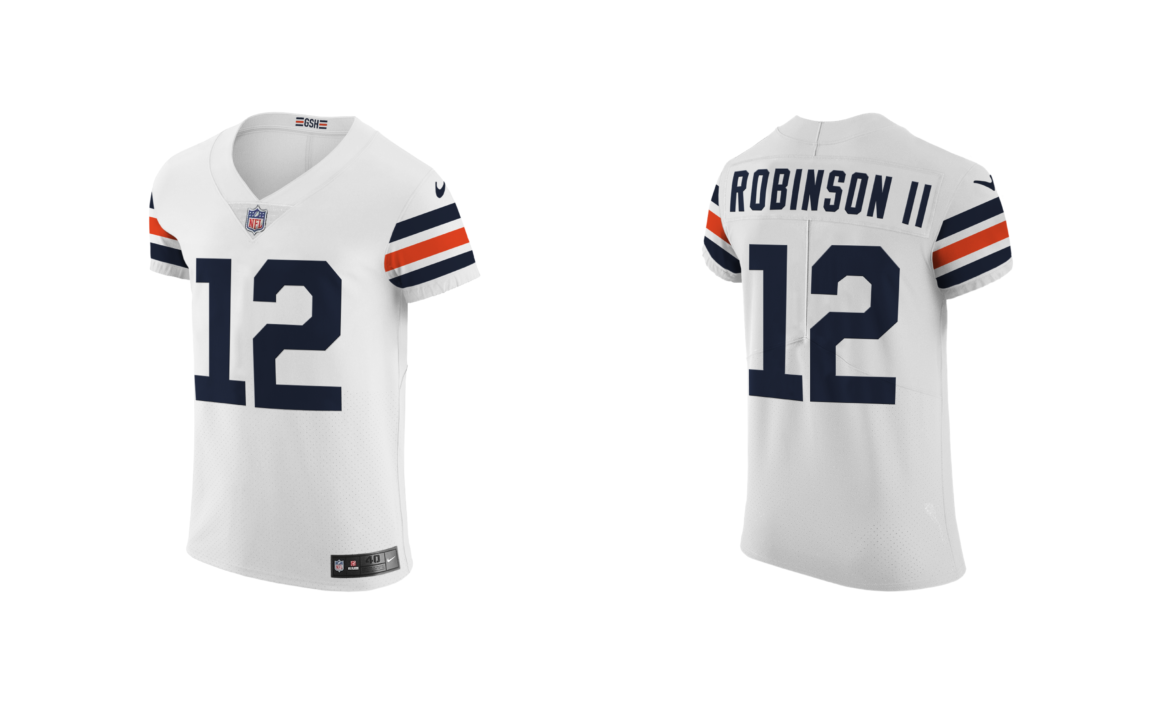
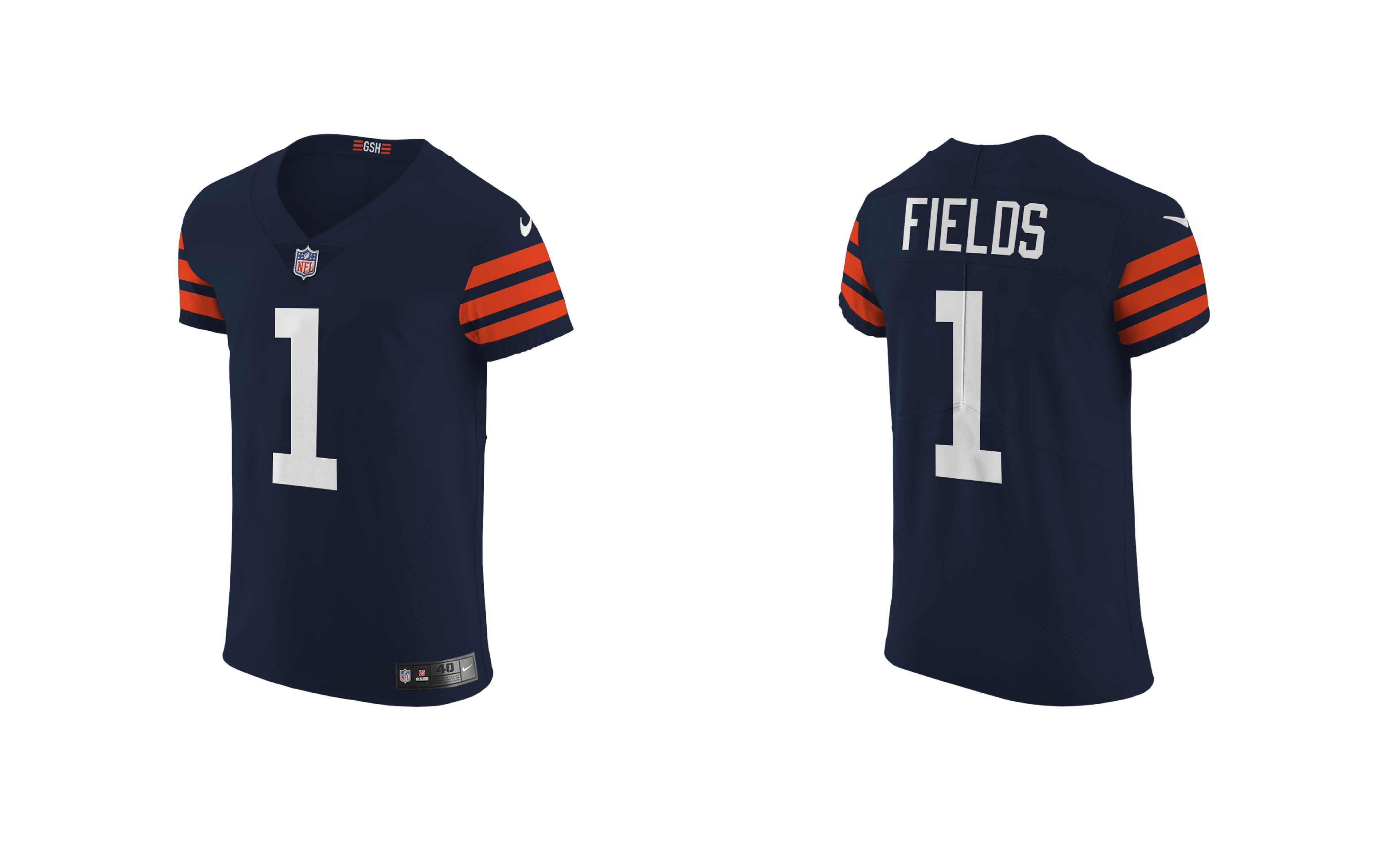
The new uniforms that the Chicago Bears will dawn are a mashup of the current style uniform with a heavy dose of the newly used 1936 uniforms and the 1940’s uniform the team has been wearing since 2012, allowing for 4 new and distinct uniforms to choose from.
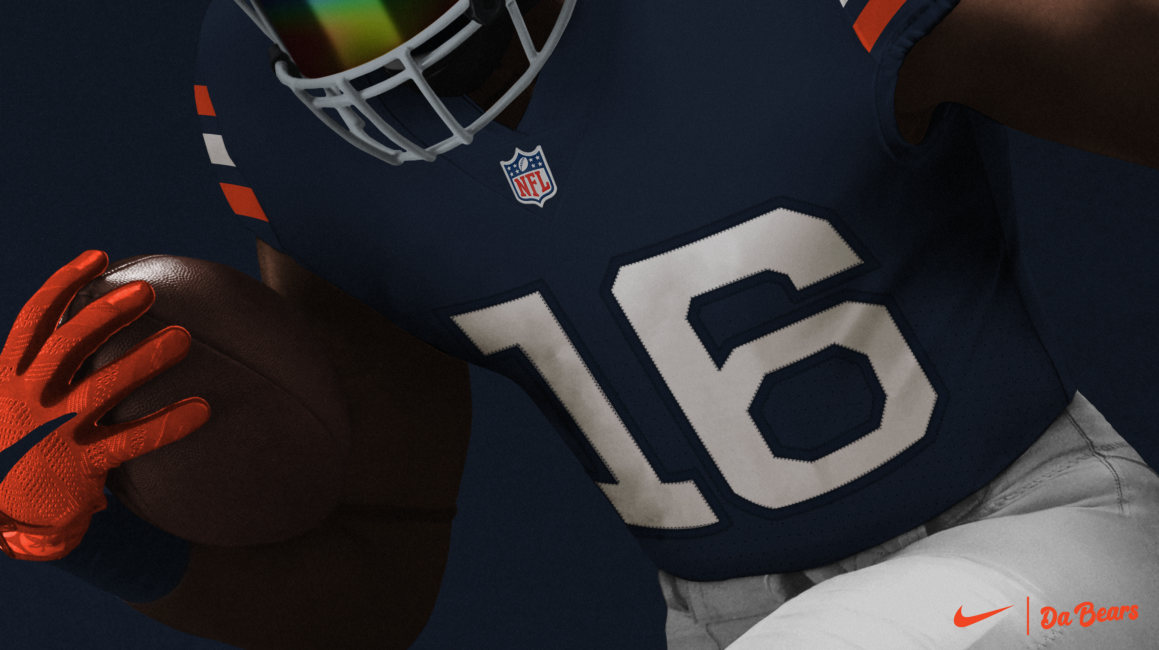
The home uniform will feature a new modernized version of the classic 3 stripes across the shoulders. Alternating from orange to white and back to orange to match the socks, similar to the current and newly proposed away uniform, which allows for a more cohesive branding. A new updated alt orange jersey with the three stripes & numbers now in a solid navy blue. The new ColorRush uniform gets its origins from that 1940 Bears uniform, where all three stripes are solid orange but the number is now a solid white color, giving it a sharper contrast.
The team will have 3 helmets to choose from, two with the new updated wishbone C logo in orange/white & another in all white. With the fourth being the 3 orange striped alternate (mainly used for the away/1936 themed ColorRush uniform. The helmets will feature a new dual toned metallic painted helmet fitted with a dark, matte gray facemask.