Jupiter Hammerheads: Branding Identity
Jupiter, Florida; known for its laid-back beach areas, breathtaking lighthouse views and beautiful natural landscapes. One of Florida’s hidden away areas that is great for its endless number of family friendly events from visiting the Hobe Sound National Refuge, walking along the beach & catching a brief glimpse of a loggerhead turtle daring journey into the ocean for the first time or just simply enjoying America’s greatest pastime – BASEBALL! Minor League Baseball to be exact, Jupiter has been the spring training & minor league home for the Miami Marlins Single-A affiliate Jupiter Hammerheads since 2001.
Minor League Baseball has seen its fair share of changes – mainly in the naming department. Owners & their Major League affiliates have gone from generic simple names like Fort Myers Miracle, Missoula Osprey & Staten Island Yankees to more unconventional names like Fort Myers Mighty Mussels, Missoula PaddleHeads and Staten Island Pizza Rats.
MISSON
With the landscape of Minor League Baseball having changed so much in the last five years. My focus for this project was not to be a complete identity rebrand overhaul, but more of an identity refresh, giving the Hammerheads a refreshingly color palette and new set of logo and wordmarks – along with a custom logo and uniform that help bring awareness to the Loggerhead MarineLife Center, an ocean conservation organization and sea turtle hospital located adjacent to one of the most important sea turtle nesting beaches in the world.


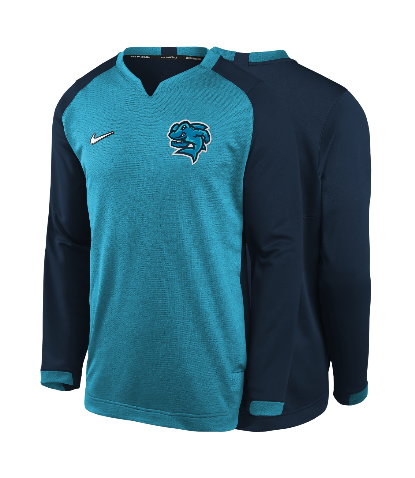
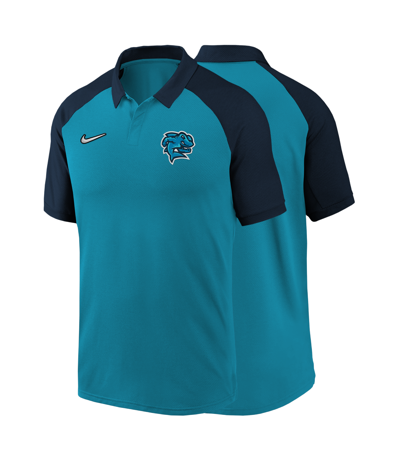
TEAM BRANDING
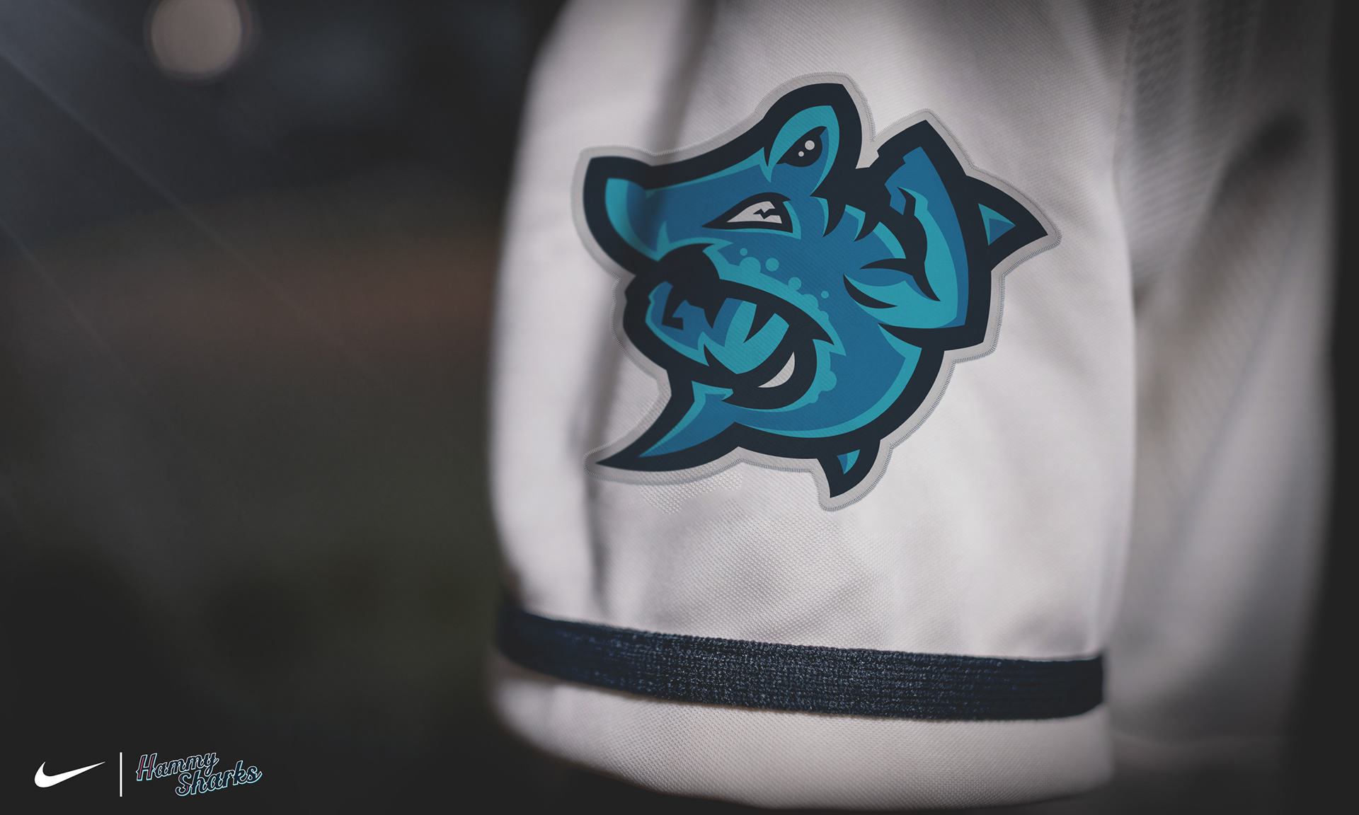
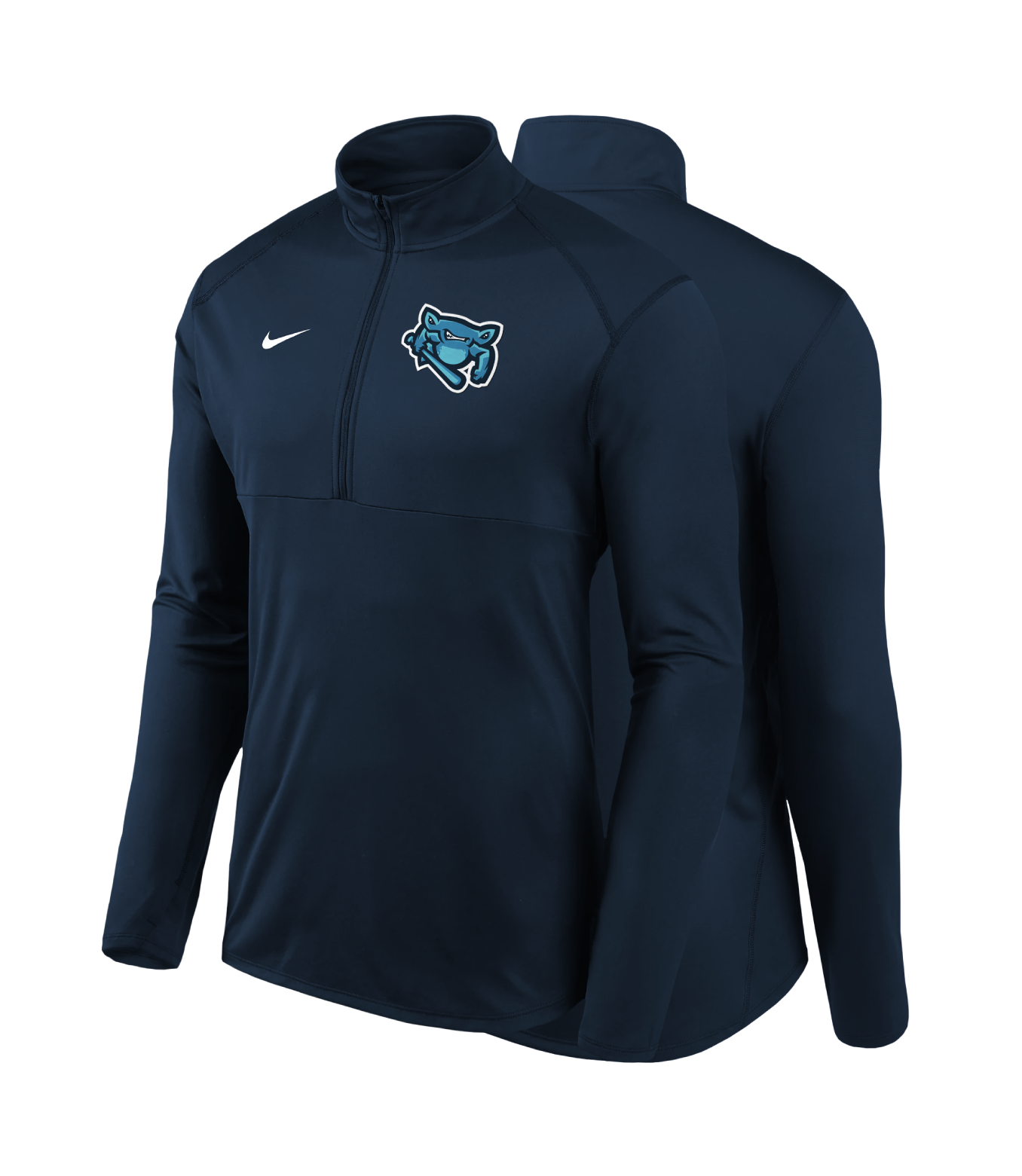
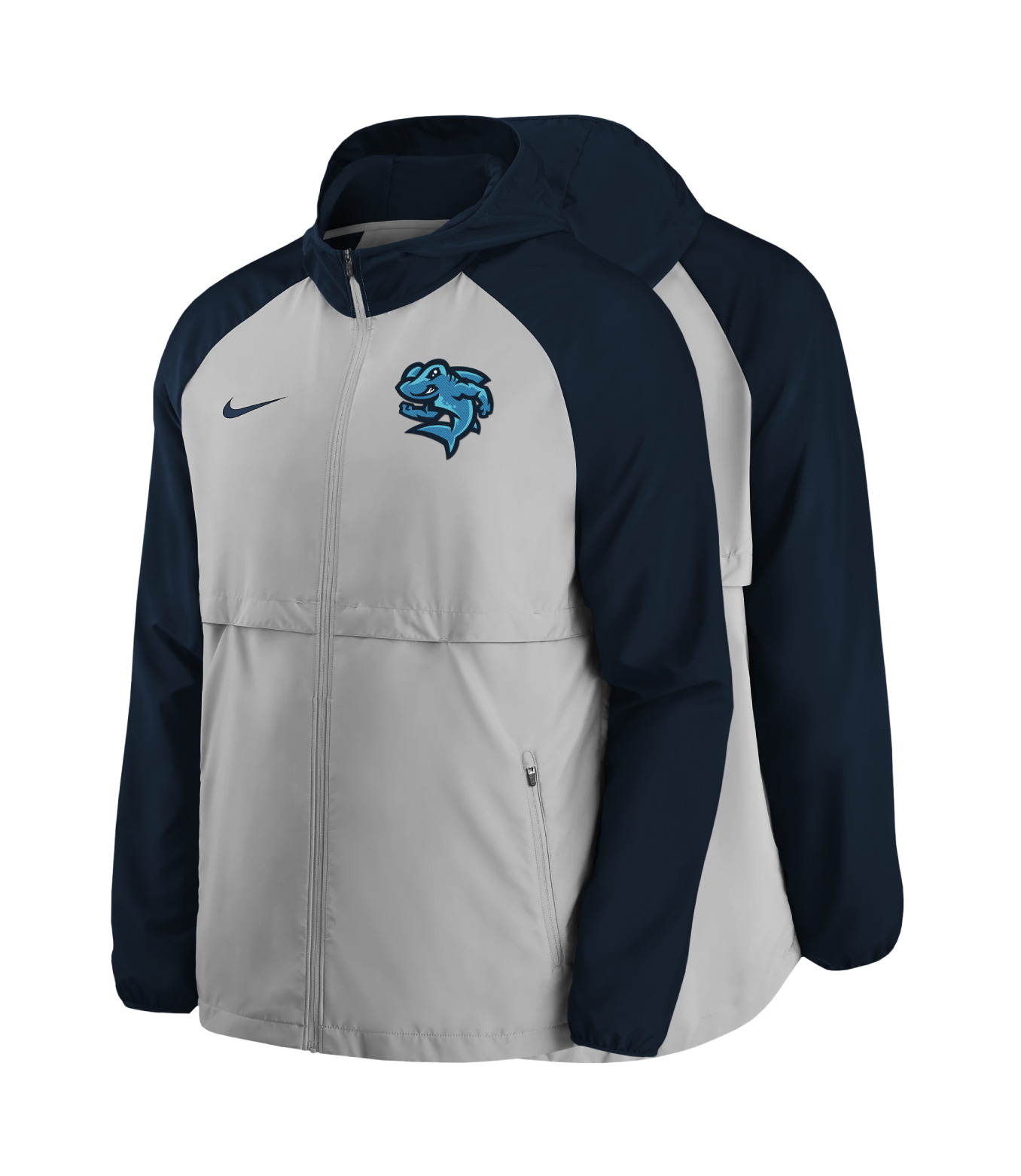
This refresh gave me the opportunity to create a new set of logos of the team mascot. Each primary logos features Hammy the Hammerhead in three different positions. In addition to this new set of primary logos, I've integrated a new & refreshing color palette which includes three shades of blue: dusk, ocean & sky blue pulls them all together. Each shade of blue were used to remind you of the multitude of colors seen from the city's breathtaking ocean views.
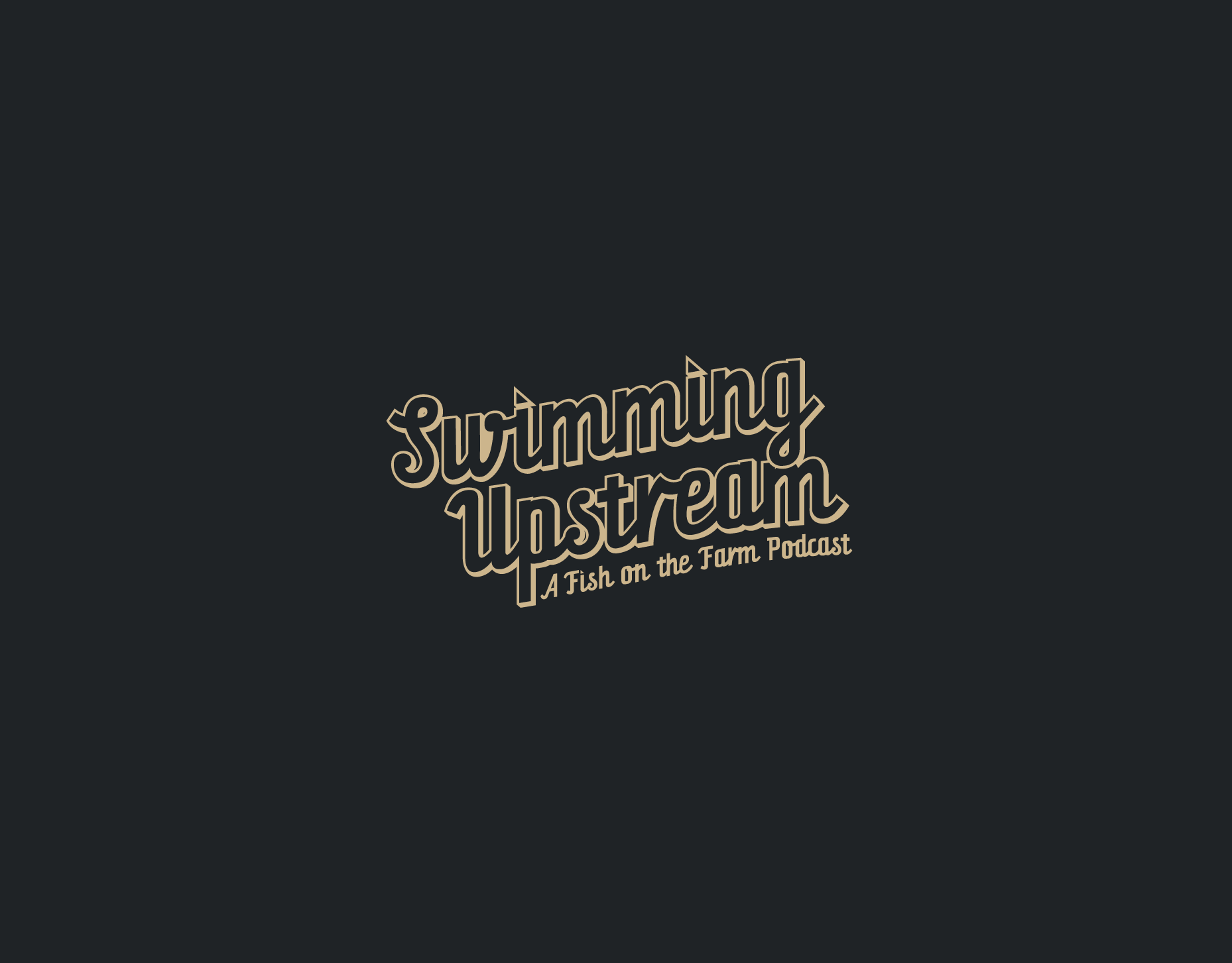
For the teams new wordmarks, I went searching for a font that helped strike a clearly unique balance of traditional and fun - all the searching led me to Orchid Key font. A font that hits all of the key points I wanted. The altering spur & inline slices for the wordmark first letter & official team numbers.


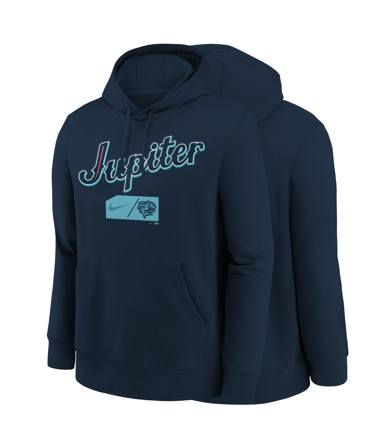
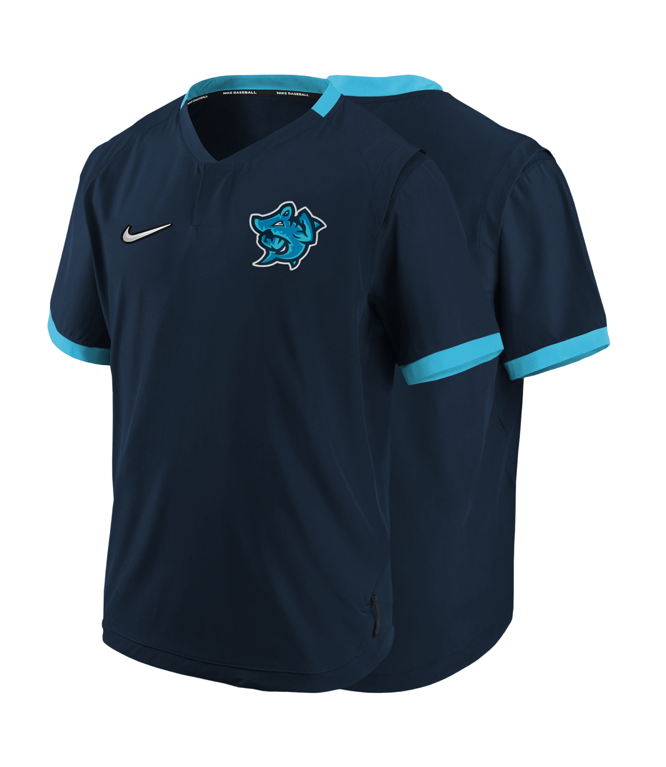
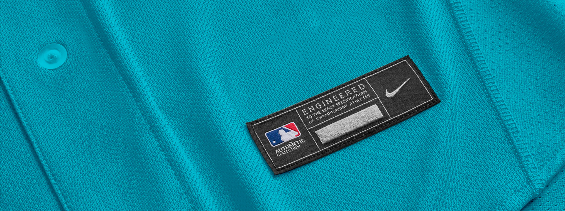
TEAM UNIFORMS
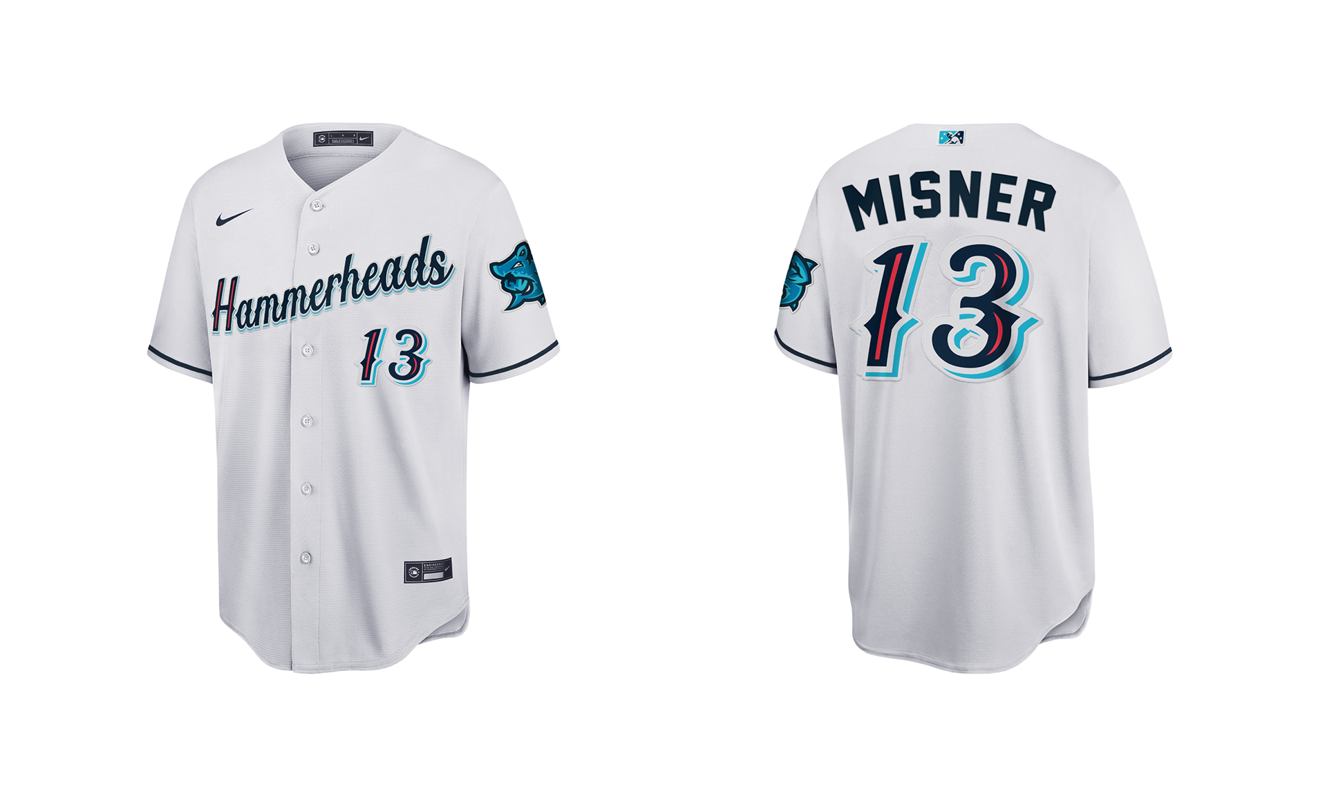
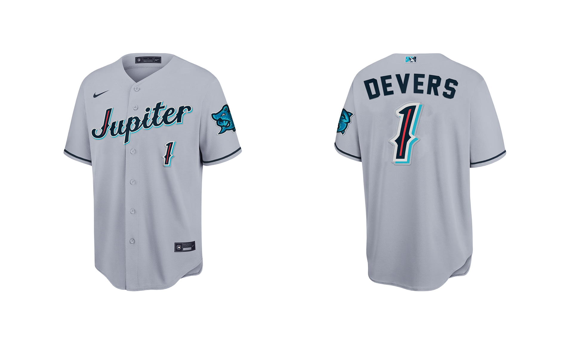
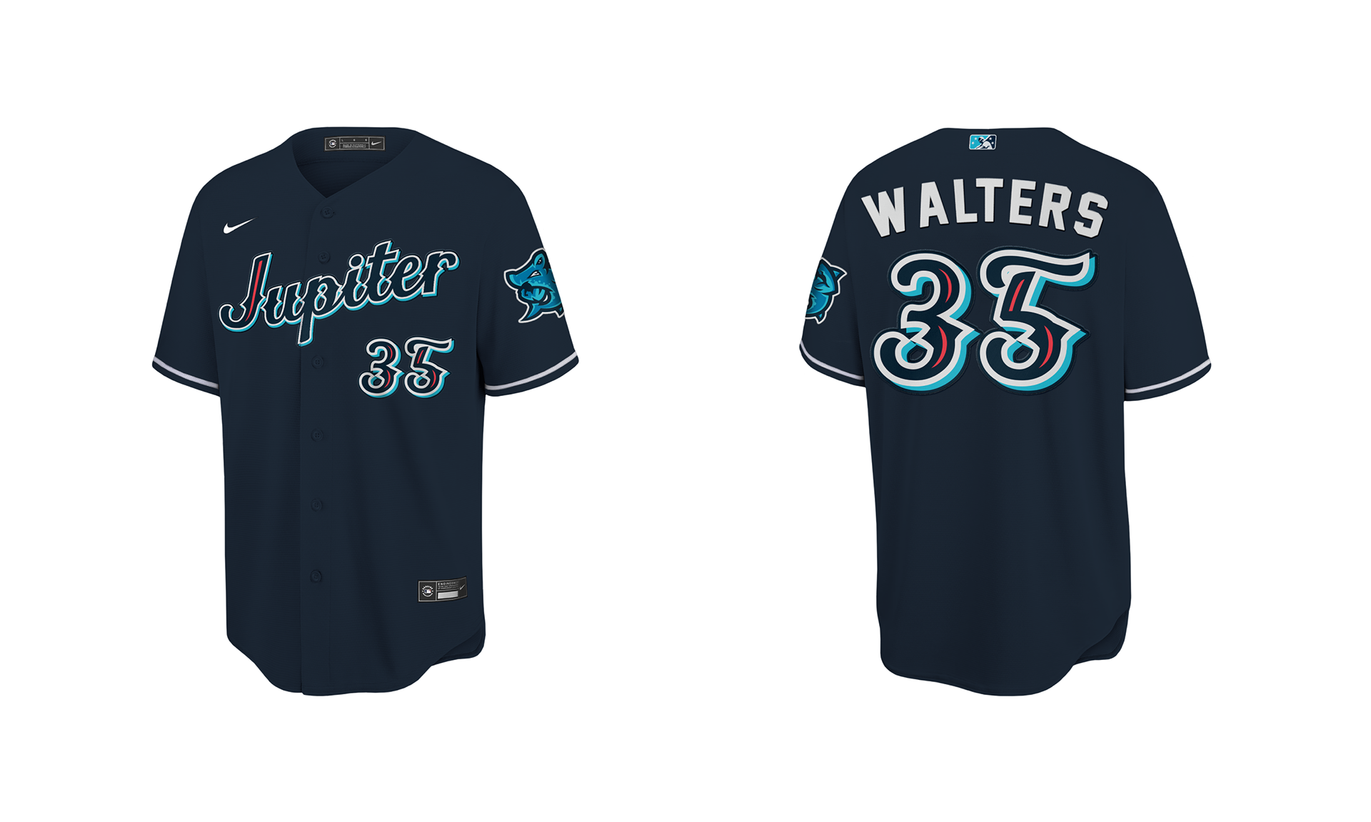
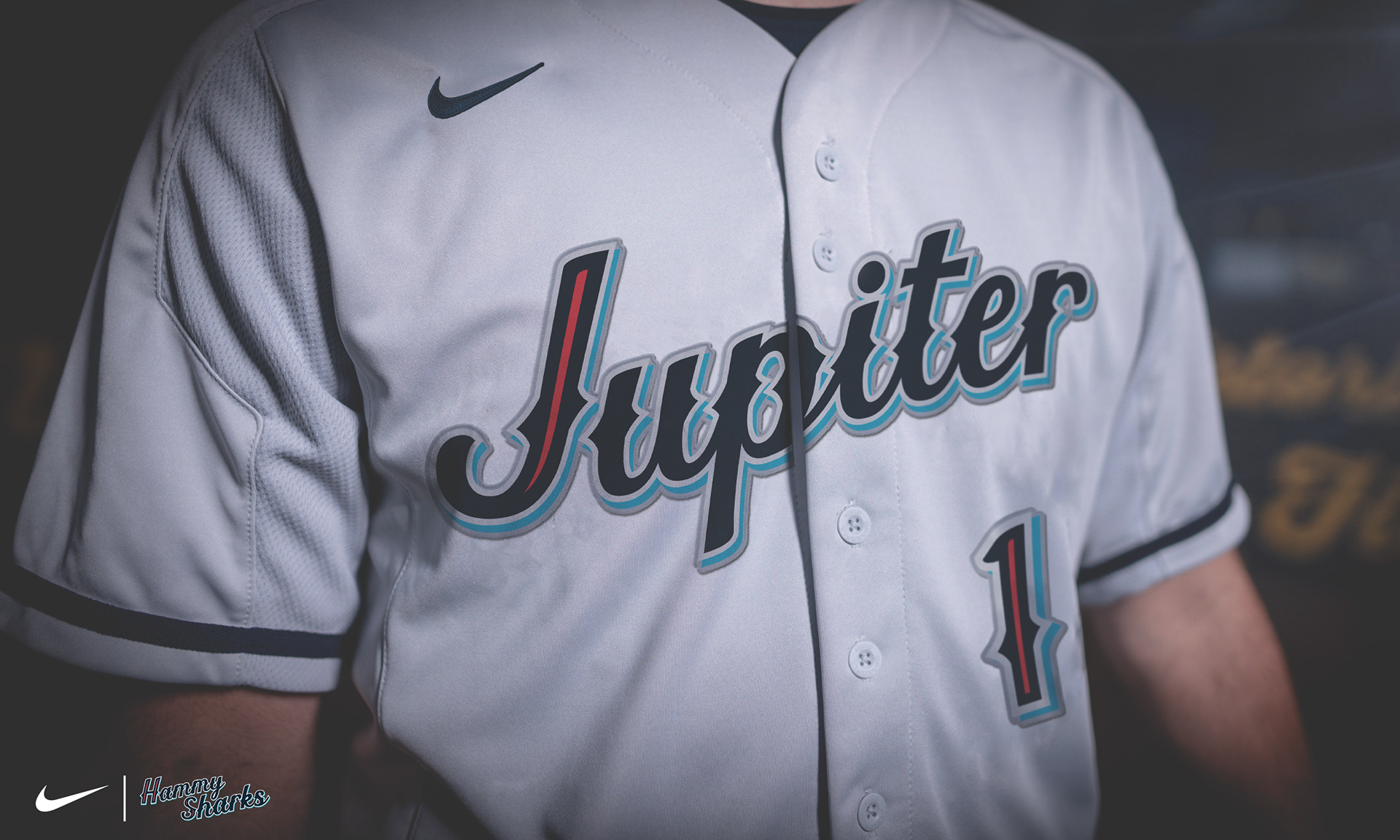
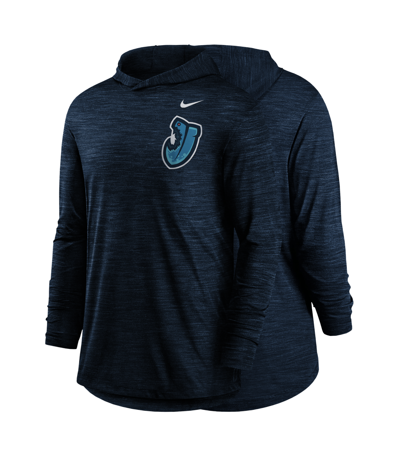
Simple, clean & traditional. The Hammerheads will dawn a set of three uniforms: A home white uniform that will have the wordmark Hammerheads across the chest, a gray away & navy blue alternate uniform with the wordmark Jupiter across the chest. All three uniforms will have the same navy blue hat with the main primary Hammy the Hammerhead logo on the front.
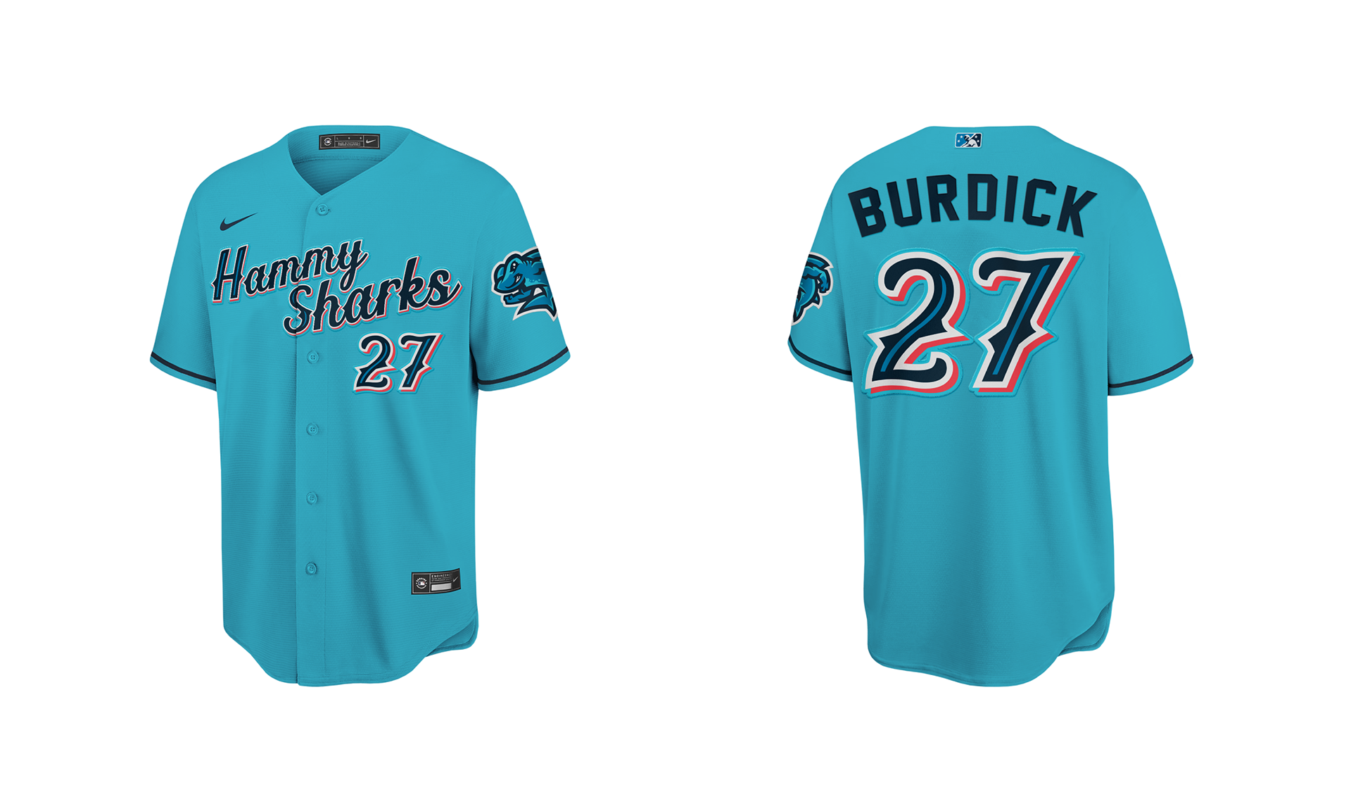
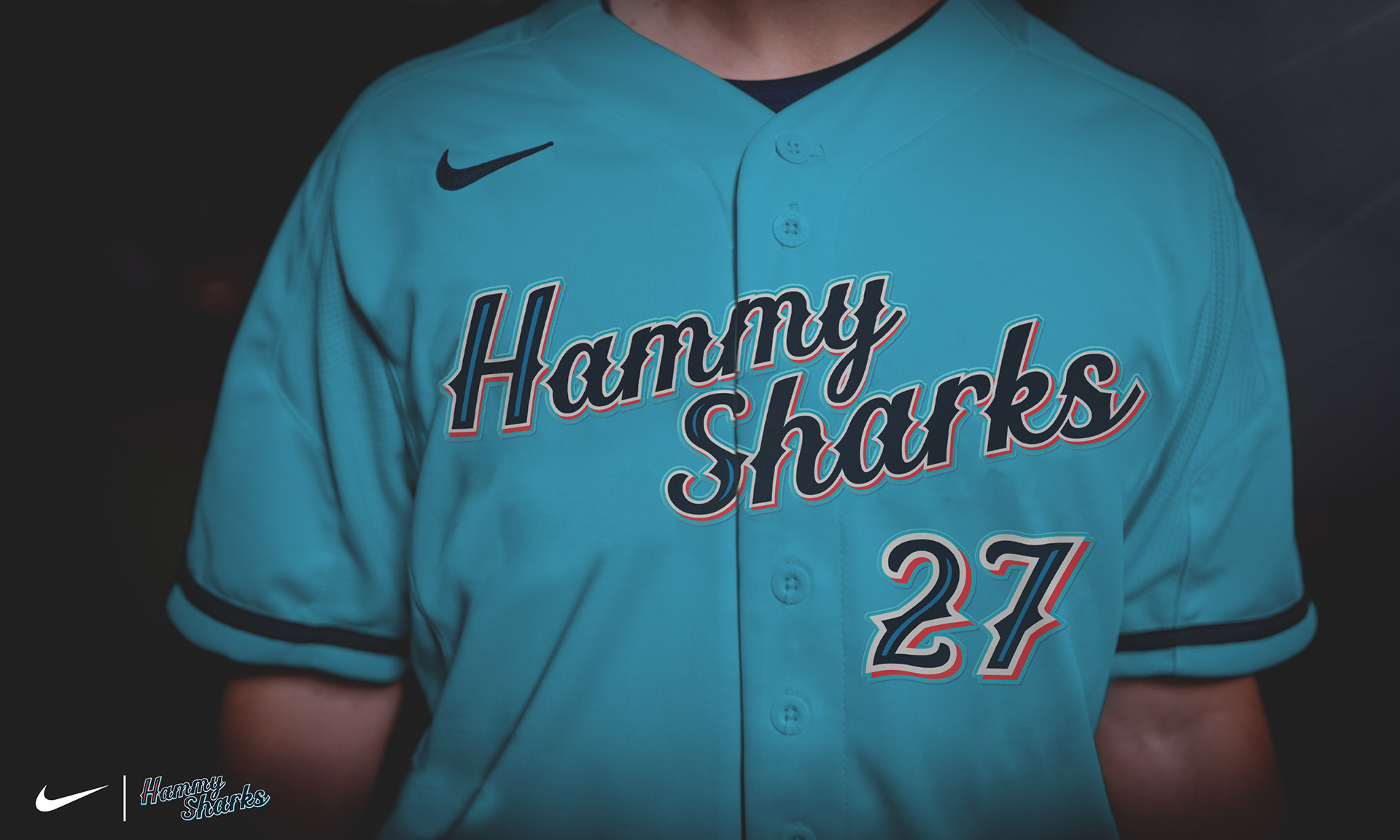
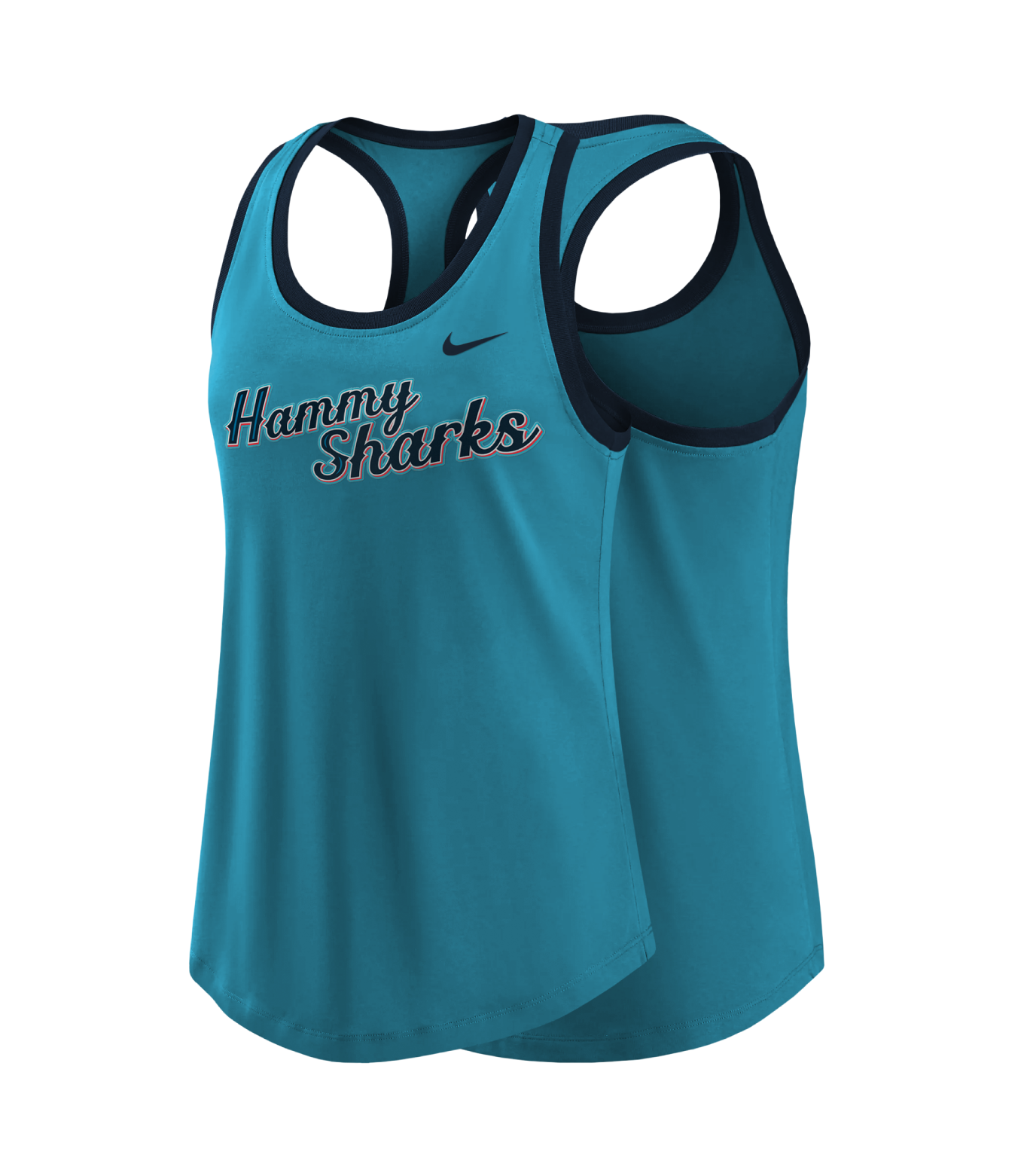
In addition, the Hammerheads will have an additional uniforms only to be worn for special event games. A sky blue jersey with a unique Hammy Sharks wordmark to go along with a matching pair sky blue colored pants & a sky blue hat with alternate logo.