Jupiter Hammersharks: Branding Identity
Jupiter, Florida, is a coastal town in Palm Beach County with a history that dates back thousands of years. Before European settlers arrived, the area was inhabited by Native American tribes, including the Jega people. In the late 1800s, Jupiter began to take shape as a small settlement, named after the Hobe tribe whose name was recorded by Spanish explorers and eventually evolved into "Jupiter." The construction of the Jupiter Inlet Lighthouse in 1860 became one of the town’s most iconic landmarks, symbolizing its role as a key point for maritime navigation. The lighthouse remains a centerpiece of Jupiter's history, standing as one of the oldest structures in South Florida.
Jupiter has a rich history tied to baseball, with the sport playing a significant role in the town’s development. Originally a small coastal town, Jupiter's transformation into a sports hub began in the 1990s when the Roger Dean Stadium was constructed. The stadium, which opened in 1998, became a key site for baseball, hosting spring training games for Major League Baseball teams. It attracted teams like the St. Louis Cardinals and the Miami Marlins, making Jupiter a prominent location for baseball enthusiasts and professionals alike.
The Jupiter Hammerheads, a minor league baseball team, were established in 1998, the same year as the opening of Roger Dean Stadium. As a Class A-Advanced affiliate of the Miami Marlins, the Hammerheads have served as a developmental team for young prospects aiming to make it to the major leagues. Hammerheads share Roger Dean Stadium with the Palm Beach Cardinals, the St. Louis Cardinals’ minor league affiliate. This unique arrangement has made the stadium a year-round baseball venue, hosting both minor league games and spring training for MLB teams. The Hammerheads' impact on the town extends beyond sports, as they have contributed to the local economy through tourism and community events. Today, the team continues to be a vital part of Jupiter’s identity, attracting baseball fans from across Florida and beyond.


TEAM BRANDING
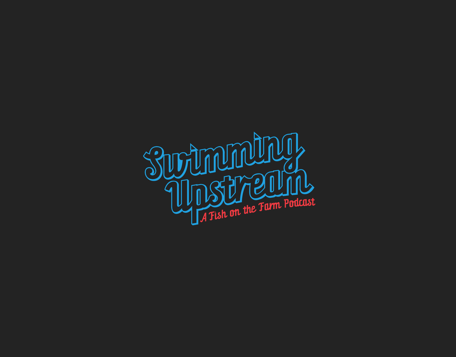
Over the past few years, Minor League Baseball has undergone significant changes, leading to the need for an identity refresh rather than a complete overhaul. The focus of this project was to introduce a new color palette, updated logos, wordmarks as well as a new team name. Changing the team name from the Jupiter Hammerheads to the Jupiter Hammersharks adds a fun and quirky twist that perfectly fits the playful spirit of Minor League Baseball. Hammersharks blends the fierce image of a shark with a unique, creative spin that stands out among the league’s famously odd and memorable team names, like the Trash Pandas, Sod Poodles or the Fly Squirrels. This new identity not only keeps the local oceanic theme but also taps into the lighthearted and family-friendly nature of minor league culture, making it a perfect fit.
As part of the refresh, I created a new set of logos featuring Hammy the Hammerhead Shark, the team mascot. This primary logo is complemented by a new color scheme that includes three shades of blue: dusk, ocean, and sky blue. Each of these shades was carefully selected to evoke the varying hues of Jupiter’s breathtaking ocean views. The combination of these colors gives the team's visual identity a fresh and modern appeal. The new design not only redefines the team's image but also celebrates the natural beauty of the area.
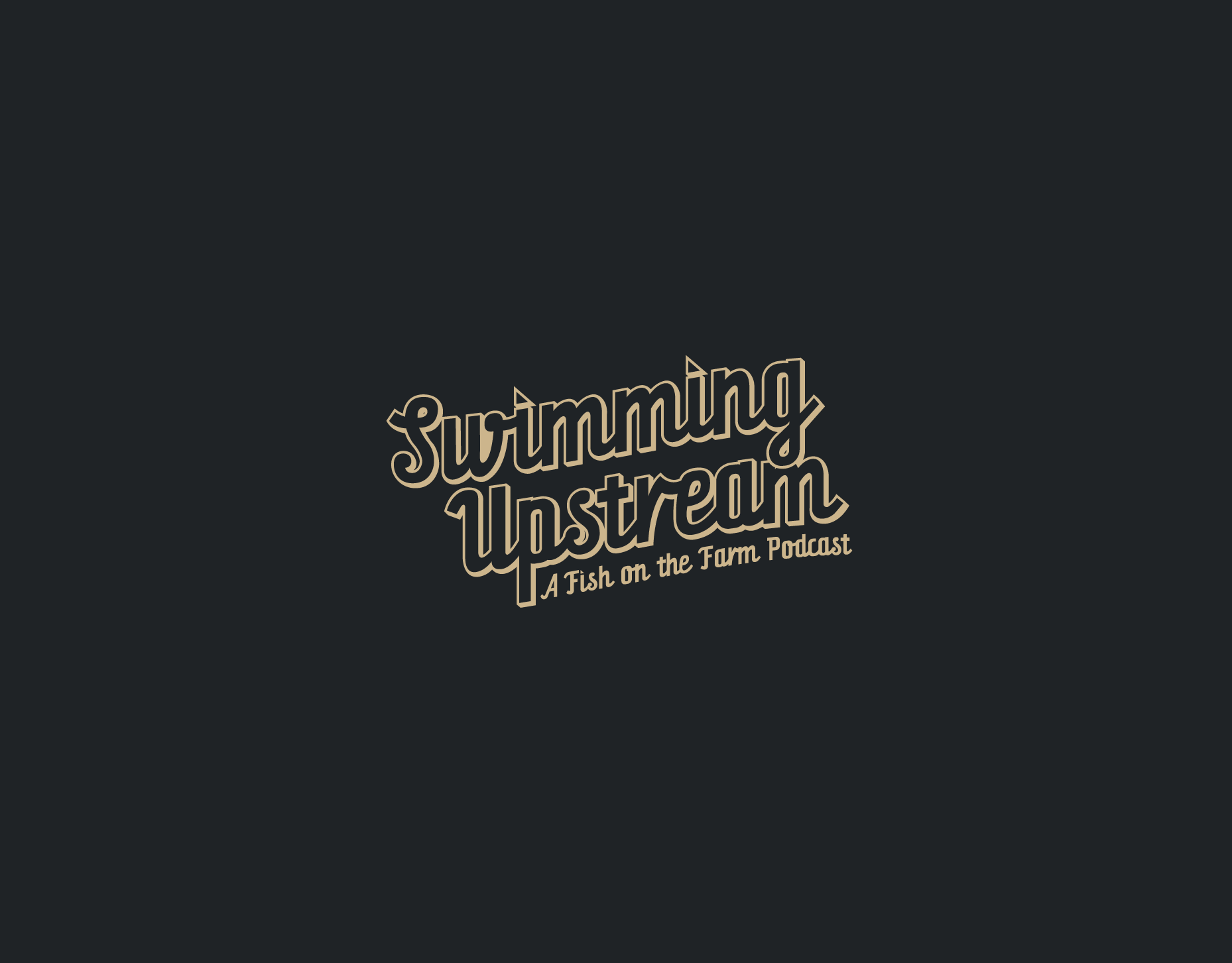
For the new wordmarks, I searched for a font that balanced tradition and fun, ultimately choosing Orchid Key for the font. This font struck the perfect balance I was looking for, with its distinctive spur and inline slices, adding a dynamic and playful touch to the team's branding. The same font is used for the wordmark’s first letter and the official team numbers, enhancing the team's visual identity. Together, these elements create a cohesive and refreshed look for the Jupiter Hammersharks.


TEAM UNIFORMS
The new uniforms that the Chicago Bears will dawn are a mashup of the current style uniform with a heavy dose of the newly used 1936 uniforms and the 1940’s uniform the team has been wearing since 2012, allowing for 4 new and distinct uniforms to choose from.
The home uniform will feature a new modernized version of the classic 3 stripes across the shoulders. Alternating from orange to white and back to orange to match the socks, similar to the current and newly proposed away uniform, which allows for a more cohesive branding. A new updated alt orange jersey with the three stripes & numbers now in a solid navy blue. The new ColorRush uniform gets its origins from that 1940 Bears uniform, where all three stripes are solid orange but the number is now a solid white color, giving it a sharper contrast.
The team will have 3 helmets to choose from, two with the new updated wishbone C logo in orange/white & another in all white. With the fourth being the 3 orange striped alternate (mainly used for the away/1936 themed ColorRush uniform. The helmets will feature a new dual toned metallic painted helmet fitted with a dark, matte gray facemask.